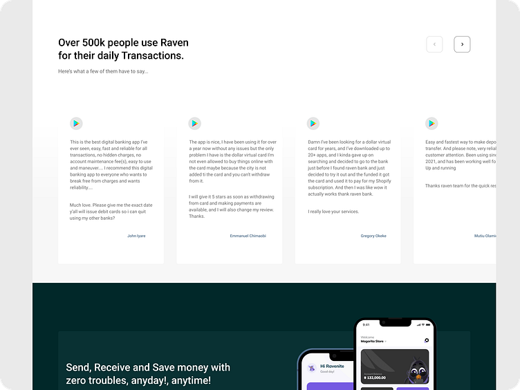
Testimonial Section from Raven Bank Landing Page Redesign
I noticed from the testimonial section of Raven Bank's landing page that the names of the testifiers are more visible than what they had too say.
So i reduced the size of the names, changed their position from the top of the review box to the bottom left and made the reviews more visible because that is what users are more interested in.
Let me know what you think, what would you have done better with the review section?
More by Ndy View profile
Like
