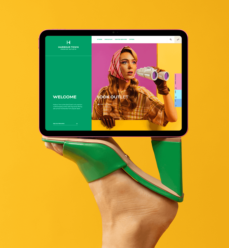
Harbour Town Website
Every year, thousands of shoppers flock to one of Harbour Town’s two Australian locations for big-brand shopping and even bigger discounts.
Working with the Harbour Town team, we designed and developed a new website from the ground up. One that brought their 'premium, with a little fun' brand to life, and put user experience at the forefront.
A site that's as easy to navigate as the outlets are.
Like the people visiting their outlet locations, Harbour Town’s online visitors come in many shapes and sizes, all looking for something different. From checking opening hours, to finding a store’s contact number, knowing where to park or viewing current leasing opportunities, it was important to maximise audience engagement through a seamless, intuitive and easy-to-navigate design, optimised for every device.
Mobile first
You've walked into the shopping outlet and now its time to find your favourite store. Not-a-worry, we've got your back, a seamless mobile experience that puts the map front and centre.
Little moments of magic
Hover states, transitions and interactions make for magical and memorable experiences that users come back to time and time again.


