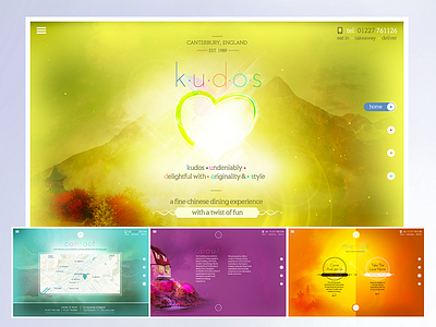
A restaurant but not as you know it
Hi all - I just want to give a little back story to a new site that we’ve been working on at Dodgems & Floss:
We were recently approached by a client who wanted a new website for their 'fun' Chinese restaurant based in Canterbury, called Kudos.
The client had a specific vision of what they wanted on the site, which at first seemed contradictory to one another. Above all the client wanted:
- Bright images
- Colour, lots of colour
- Light bursts, stars, etc.
- Butterflies and hearts
- A refined feel
- Have a nod or two to it's Asian heritage
It took a lot of close communication with the client but it really wasn’t until the design team spent time in and around the restaurant, when we were able to appreciate what a Kudos experience was. With their brightly decorated butterfly walls, waiting staff wearing quirky hats and even a ‘transgender’ toilet - it was clear this was a restaurant that was just as much about the "experience" as it was the food.
Once we understood this the original brief took a different shape and we were able to produce a design that: 1) We felt worked 2) Properly reflected a Kudos dining experience and 3): Followed the original brief that the client had envisioned when commissioning us.
I’m pleased to exhibit our final efforts here: http://www.kudosrestaurant.com
Thanks for listening!


