Robin Popp & Associates Logo and Branding
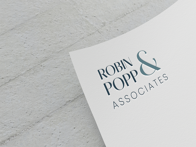
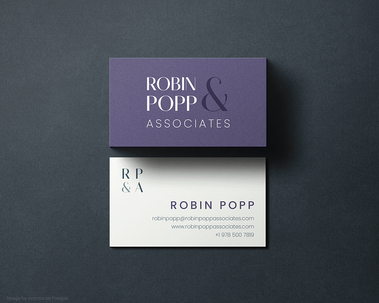
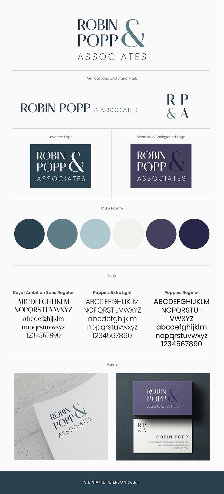
Robin Popp & Associates is a newly-started Non-Profit Consulting and Recruiting agency that needed a logo, brand identity and business card design to help aid it’s growth in the market. The client wanted something sophisticated, modern, clean, bold and approachable. She also wanted to incorporate jewel tones, teal and aqua into the branding. The logo needed to be adaptable for any future social media or printed materials and since it is a consulting firm, it did not need a pictorial brand mark. The final logo design is wordmark style featuring a sleek combination of sans-serif fonts. The introduction of two fonts and two colors adds a dynamic quality to the logo. The business card introduces the secondary purple tones with a bold frontside, while still maintaining the integrity of the original logo colors on the back.