CROPP redesign

Hello! Review my redesign concept for the CROPP shop.
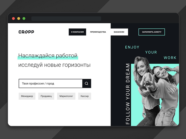
Description: a triad of colors was chosen as the main colors. The first color is black, the company's corporate color. The second color is white, it creates the necessary contrast. And the triad closes with a bright turquoise color, used to create bright and catchy accents in design elements. To quickly solve the problem, the job search is placed in the center of the first screen.
What do you think about it?
More projects you can see on my Behance.