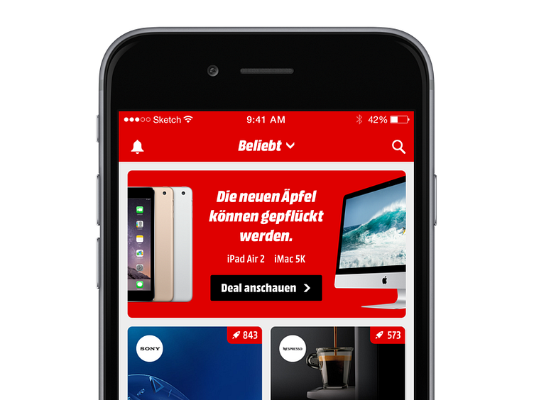
Exploration Feed
An exploration screen I have been working on. Main challenges were:
– Highlight products and brands without distracting users by the (necessary) information. – Flexible approach that caters for all kinds of brands and curated images. – Adapt the companies visual language, yet infuse a fresh breath in to the aesthetics. – Establish an approach of elements that can be followed through-out the app to be as consistent as possible.
More by Thierry Meier View profile
Like
