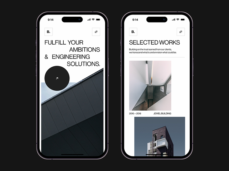
Mobile concepts design for an architectural studio | Lazarev.
Let’s cut straight to the chase and check out this fresh out of Figma concept design, shall we?
We shall 👇👇👇
So we already shared with you our vision for a website of an architectural studio with its minimalist and urban vibe and chiseled, well-structured composition. And we didn’t want to leave this experience to desktop users alone.
📲 Our design team developed the website’s mobile version, so that nothing limits people from engaging with an architecture studio from any device. To transfer that design, we leveraged a grid system to align all page elements and place text and images in a way it seamlessly fits into a smartphone format.
As a result, the site’s concept UI looks neat and fresh on a small screen, empowering website visitors to explore the world of architecture even on the go 🙌
Our creative concept game doesn’t stop here. We've got some more 😉
What do you think of this concept design? Share your feedback 💚
📩 If you have a project in mind, reach us out at hello@lazarev.agency
Website | Facebook | Behance | Linkedin | Instagram | Twitter

