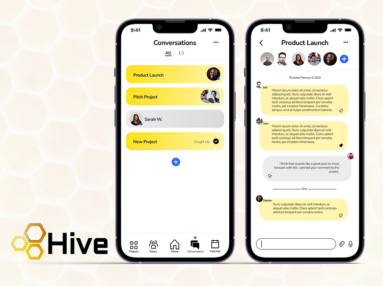
#DailyUI Day 13: Direct Messaging.
For the prompt today, I decided to play around with a design for a productivity/collaboration app, "Hive." Conversations is one of the main navigation components and then the user is able to see a list of all of their conversations organized by project or just private 1:1 conversations. Users would be able to pin individual messages to the project providing an easy way to remember and go back to a specific comment. The pins would be visible in the project page.
Drawing on the product name, the interface uses yellow tones. Blue provides a contrast for alert indicators and actions. And then, to prevent things from becoming too bright and overwhelming, the majority of the app is tones of black and grey on a white background.
More by Alyssa Hennessey View profile
Like
