Daily Logo Challenge #08 - Ski Mountain
#dailylogochallenge
The subject for this one was a bit odd - ski mountain logo. Not entirely sure what we're branding here: a tourist attraction, a ski slope, a ski school, a ski lift or some combination of any of these.
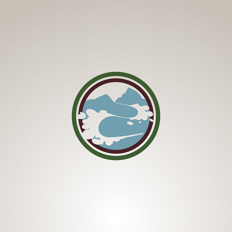
Because of this, I just focused on the only sure thing about this brief - the skiing and the mountain. I wanted to make sure there is some sort of mountain looming in the background, while our main focus was the skiing.
As usual, I wanted to avoid the most obvious solution of just putting a pair of skis in the logomark, so I turned my attention to the act of skiing, instead of the implement.
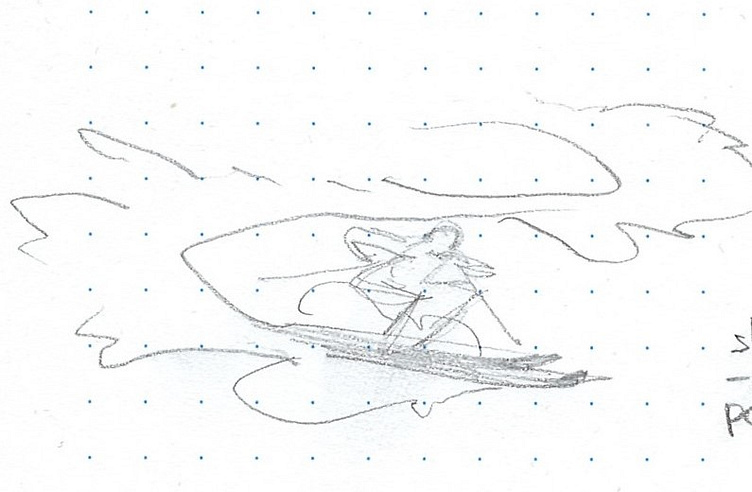
I started with a person carving downhill, while throwing clouds of snow on every turn. This felt good, so I started experimenting with different snow textures and integrating it with the mountains in the background.

That seemed alright, so I moved on to Illustrator to recreate the sketches using vectors. I used a bunch of ellipses to set the outline of the snow clouds.

Finally, I cleaned up the vectors and used an earthy colour palette along with some background grain to tie everything together.
I'm generally happy with how it came out, but if I had more time to spend on this, I would simplify the shapes and balance the composition a bit better.
