Hessleby Homes - Rebrand
Then Ash Home Developments, a UK property development company, engaged our team for a complete rebrand, including a new name and updated design. With a focus on the four pillars of the company ethos, we transformed the brand’s look and feel.
The brief
The property development company, Ash Home Developments, approached our team with the goal of taking their brand to the next level. They required a new name with more availability across digital platforms and an updated brand design that reflected their company ethos.
A new name
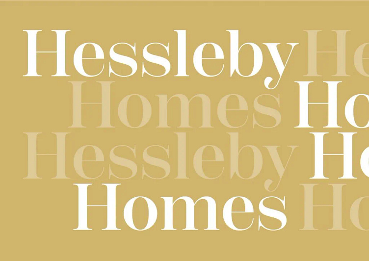
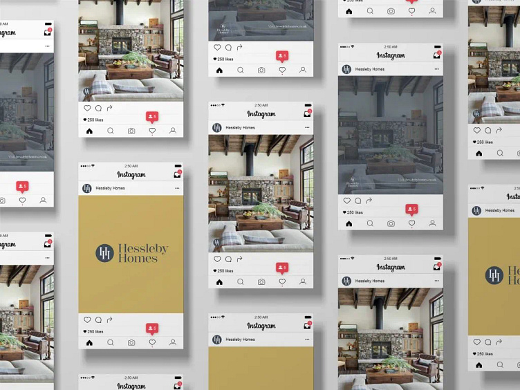
In finding a new company name, we hoped to evoke a traditional, warm, and natural feel. A combination of words would provide digital availability not possible with the original company name. The name, Hessleby, was created using elements of the two directors’ surnames, Hession and Appleby, in order to feel like a family name and invoke the emotional effect that can come from family: trust, togetherness, warmth and stability.
Defining the brand
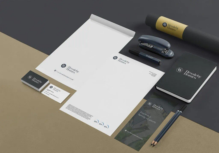
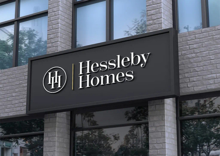
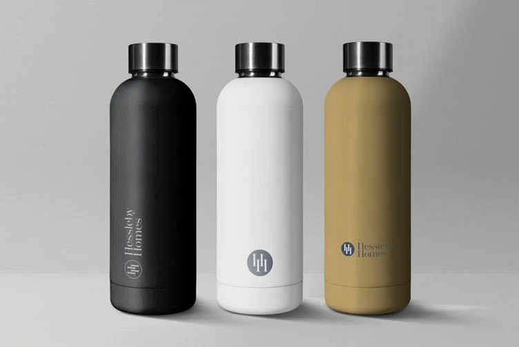
In keeping with the theme of tradition and familiarity, the brand utilises a crisp, traditional serif font matched with contemporary warm colours. The accompanying icon features the company initials, a set of overlapping H’s. These can be perceived as pillars for the stability, a subtle nod to both the element of luxury home architecture as well as the four pillars of the company ethos.