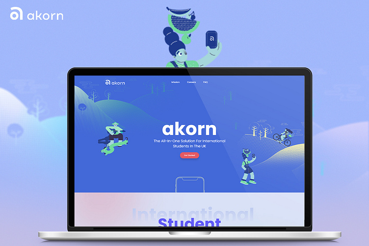
Akorn Website UI
Hello Dribbblers! 👋
We’re excited to showcase our work for Akorn, a financial solution platform for international students in the UK! 🎓💸
We designed a user-friendly, informative one-pager that simplifies access to Akorn's services. The vibrant UI, featuring modern design elements and 3D icons, provides a seamless experience, while interactive features guide students through financial services like bill management and account setup.
📌 Explore our Behance case study for the complete story! - Akorn
Your feedback means the world to us – let us know your thoughts! 🙌
Thanks for checking it out!
We're open for new projects! Bring your ideas to life 👇️️️️️️
Or drop us a line:
Follow us on:
More by Pixel Street View profile
Like


