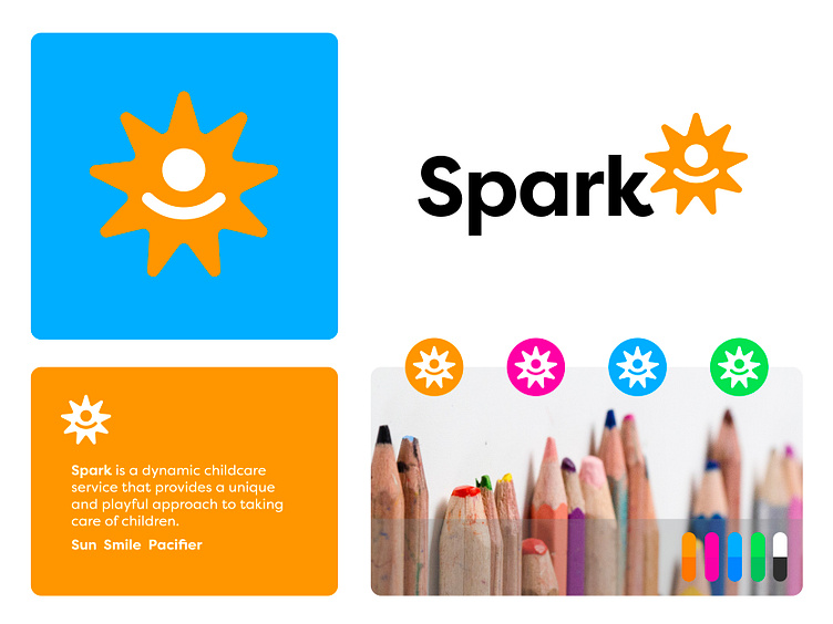
Spark - Childcare Service
Logo and identity design for Spark.
Spark is is a dynamic childcare service that provides a unique and playful approach to taking care of children.
Concept
I had the idea of using a sun for the 'positive' environment of the childcare. Next I wanted to refer to small children, babies and joy. Therefore I tried to visually create this pacifier that's being part of the sun. Together it's a simple and positive symbol that's representing Sparks way of working and the joy they bring to their children days.
I am always drawn to simple concepts that convey a strong and meaningful message. Would love to hear your thoughts on this project.
Have a lovely day everyone!
Jeroen
___________________________________________________________________________________
___________________________________________________________________________________
Let's work together and elevate your brand!
Feel free to reach out via Dribbble DM or E-mail:
👉 info@jeroenvaneerden.nl
💼 Connect with me on LinkedIn / Read my Client Recommendations
🎬 Check my YouTube for Logo Tutorials / Learn Logo Design
🔗 Follow me on Instagram / See BTS and New Content
💬 Tweet with me
