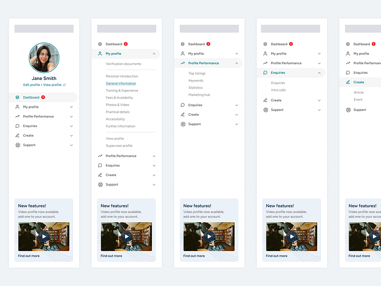
Directory Members Area
Our current members area was looking a little tired and too much like the client facing website. I wanted to transform it into more of a dashboard, making a distinct difference between the two areas.
The home dashboard needed to show more useful information, such as stats and notifications, our members shouldn't have to go finding that, they should all be linked direct from the first page. We are always improving and adding features so I wanted a dedicated area to tell our members whats new and how to use them. I settled with that being in the sidebar.
More by Kevin Lofthouse View profile
Like


