Design concept of an architectural studio website | Lazarev.
New Dribbble shot alert 📢
Are you ready to dive into the world of urban architecture? Let’s do this 🏃🏃🏃
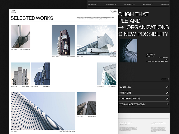
As you may have already noticed, minimalism is our best friend in this creative concept. It’s our strategic decision, as we wanted to set website visitors' attention to architecture itself.
🏛️ To share the studio’s robust portfolio, we avoided any superfluous elements that would distract website visitors and showcased projects on a neat canvas. Brief descriptions also contribute to an overall impression of the studio, sharing its experience and fundamental beliefs.
Also, the webpage’s structure plays an important role here — the case layout seems to be chaotic, but it’s an organized chaos that adds some dynamics. While the blog page has an opposite vibe — with its straight lines and symmetrical composition.
We love playing with layouts to express the project's philosophy 🙃
As we’re moving on to the next Dribbble shot of this concept design, let’s discuss this one. Drop your feedback in the comments 💚
And if you have a project to design, go ahead & contact us at hello@lazarev.agency
Website | Facebook | Behance | Linkedin | Instagram | Twitter


