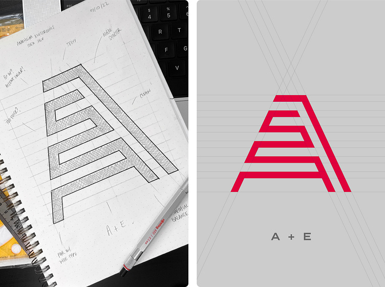
Anaheim Electronics logo design
Anaheim Electronics is at the forefront of technology; developing high performing electronic components to businesses and users across the world. The brief was relatively loose but it did specify the logo to be simple, unique and relatively futuristic.
Due to the nature of the business and industry it operates in, I was interested to explore a futuristic-feeling monogram combining the A and E of the brand name. After trying various lock ups and executions, I found great promise in a rough version of the logomark you see here which not only combined the brand’s initials but also brings in elements of a circuit board tying into the industry further.
Based on the width of the A letterform from the beautiful and subtly futuristic typeface Termina; this logomark cleverly combines a capital A and E through the positive and negative space all the while ticking the box of simple and unique. I ensured this monoline execution would be bold enough to be legible at small sizes but not too chunky to come across blunt. Pairing this with the typeface it all started from, Termina, brought perfect harmony between the logomark and type especially due to them being the same weight. Overall, I’m super stoked with this elegant and simple design!
Interested in creating or refreshing your brand's identity?


