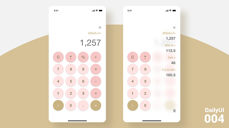
DailyUI 004
Prompt: Design a calculator. Standard, scientific, or specialty calculator for something such as a mortgage? Is it for a phone, a tablet, a web app?
----------------------------------------------------------
Just turning a simple iPhone calculator into one of my favorite color combination. I did add a back button on the left and made the 0 button smaller. I did see a lot of examples where the equal sign was big instead of the 0. The placement of the back button being there made the most sense for me because it is on the opposite side of the = sign, indicating that it is doing the opposite of finding out the answer. Definitely require some research on past user testing or do one myself to figure this one out. I also saw some examples of the equation showing up on top to see what was already typed in and added a history button up top that will show all the equation history. What do you think?
#Daily UI #004
Here is the dark mode version. I want to do different color versions like blue, green and orange 🙌


