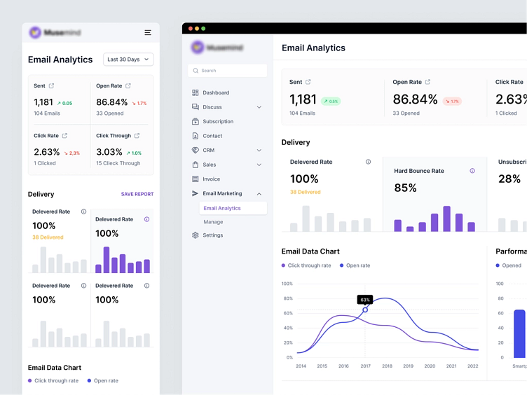
Email Marketing CRM Dashboard (SaaS)
Interactive Charts will be of no use without correctly visualizing the data; it will overwhelm the users. We designed a clean interface, balancing color harmony to make it easy to look at.
Email marketing interactive charts need different graphs to display; we carefully considered what to keep over the display to prevent viewers' frustrations'.
What do you think about it?
Like this and comment.
Schedule a call at ☎️ 👉🏼 Calendly.com
Let's talk about your project..
✉️ hello@musemind.agency
Website 🌐 musemind.agency
Explore Our Design Case Study Featuring ➡️ Behance
Let's Check Our Others Dribbble Profile:
musemind saas • musemind mobile • musemind branding
Follow us to see more exciting shots and insights on:
More by Nasir Uddin View profile
Like


