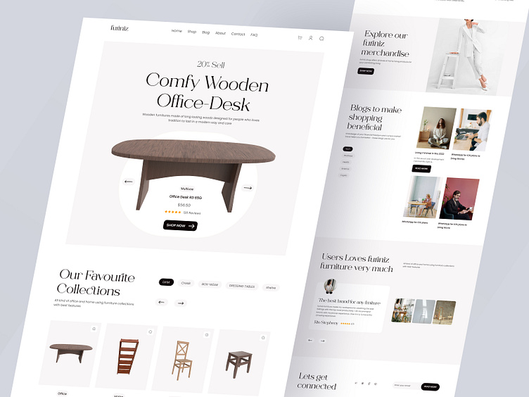
Furniture eCommerce Website
Hello Guys! what's up?
Today I am sharing my latest furniture project. I have used gray color with black color to make the design beautiful and kept the design simple and minimal. Apart from the desktop, I have made the mobile version separately to make it mobile-friendly so that every section on mobile is nicely decorated.
If you are thinking about making any kind of eCommerce website design and development, feel free to DM or email me.
Have any projects in mind? Let's Talk
☎️ Book a Call: Calendly
Connect on:
Linkedin | Instagram | Twitter
-
Follow Orizon Design:
Behance | Youtube | Twitter | www.orizon.co
Mobile Responsive
Simple
Style Guide
I have used two fonts to make the design more beautiful and readable
More by Orizon: UI/UX Design Agency View profile
Like


