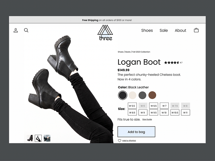
#DailyUI Day 12: E-commerce shop (single item).
For my e-commerce sight I chose something familiar to me, a shoes. I went with a simple, modern color scheme that directs attention to the variables users need to choose and the "add to bag" button as the most important features of the page. The only other comes in through the business logo at the top-center of the page.
More by Alyssa Hennessey View profile
Like
