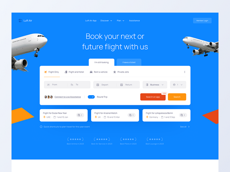
Luft Air — Airline Landing Page Hero UI
Showing features based on the airline customer category 🛩️
Hi, Dribbblers! This is my concept of a Hero for an Airline Landing Page.
Overview
Luft Air is an airline that allows users to book tickets, check in online, and perform other functions.
A. Separate based on needs
To prevent the user from becoming overwhelmed while pursuing their goals, there is an idea to separate the features shown as a tab bar that separates features based on user type.
If the user is a customer who is still looking for a flight, we offer a flight search feature, assistance, and a flight recommendation feature.
If the user is a customer that already has an account, the features shown will be online check-in to check flight schedules.
B. Increase mobile app adoption
By providing the CTA for the user to search in the mobile app instead, we could possibly increase the adoption of the mobile app.
Thank you for watching!
Follow me on Dribbble if you want to keep in touch, and press [L] if you love it! ❤️
About Designer
Rhasya Rizqi, or Rhasyab, is a product designer with years of experience in product design who is currently designing the interface and experience for Tamara BNPL while building and leading Chamjo Design, a reference tool company that is currently focused on the SEA market.
