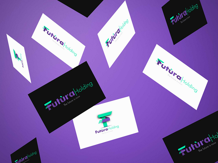
Futura Holding - Brand Design
Thinking of a Holding we immediately imagine something with an impact and which emanates stability. The choice, therefore, also due to the same name, fell on the FUTURA font, it almost seems like a sign of destiny.
This font has angular corners (in the psychology of forms a sign of stability) but also with very soft and rounded curves (indicating dynamism) which allows us to better disseminate our message:
The future is now, stable but dynamic!
Thank you for your attention!
If you want to learn more about our projects, visit www.beeasyagency.it
More by .beeasy - digital factory View profile
Like


