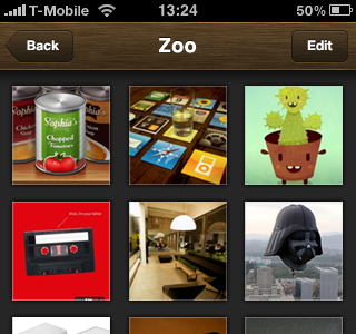
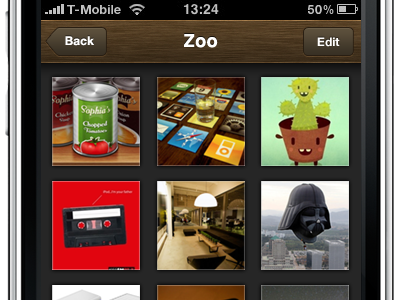
buttons revisited
Hey guys, what do you think about the new buttons? I gave them a slight wood texture and worked on the stroke, inner shadow and drop shadow. I think it looks a lot better now. BTW: which anti aliasing setting do you use in PS for iPhone text? I used "strong" but the fuzzy results – especially with tex shadows – kill me! Tried the other ones but they don't really look good either.
More by Bastian Allgeier View profile
Like

