Stationary Design
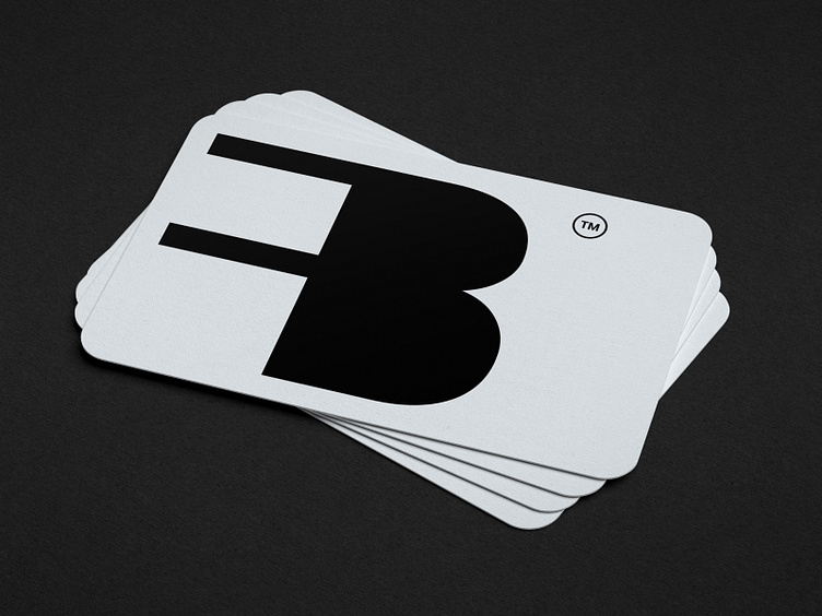
Business card design for Best Fiber GmbH — a Swiss company that provides fiber optic installation services for private and business customers.
The company was founded in 2021 by dedicated and experienced entrepreneurs from Switzerland with an aim to offer innovative solutions for modern and ultra-fast internet.
The brand identity's goal was to communicate Best Fiber’s reliability, quality, and an innovative approach. In order to achieve it, the main emphasis was put onto simplicity. The combination of light-blue and orange adds some innovativeness to the overall impression, while the clear typography transmits quality and makes information perceived effectively. Round corners of print assets and pictures refer to the logo's shape. The logo itself has an abstract nature — it was made of the first letters from Best Fiber. Its geometric and structured look makes a hint on the company’s technological niche as well as reminds of something more specific: a plug that can be indirectly related to fiber optic installation.
See the full project on Behance
Follow me on Instagram
_______
For project inquiries: contact@katezest.com
