Acorn | Brand Identity
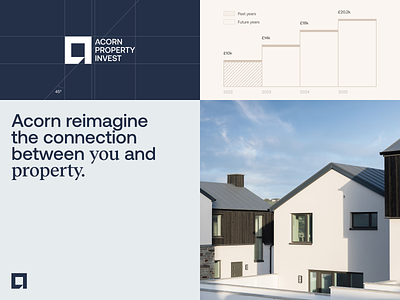
Today we can’t wait to share with you more about the recent project we worked on. We’ve made brand identity uplifting starting with the logotype and finishing with the brand color palette and fonts. The core aim was to save the cold and professional look of Acorn Property Invest but bring innovative touch to it to make Acorn stand out from the others companies.
Acorn Property Invest (API) was established to allow investors to diversify into the thriving UK property market through fixed-term investments, providing either regular, fixed income or capital growth. Acorn builds beautiful homes, where thought and attention are given to every detail.
Curious to see more? Check the whole case study here.
Get to know more about us on our website.
Follow us on Facebook / LinkedIn / Instagram / Behance
Have a project? Let’s talk: hello@unikorns.work


