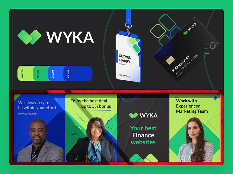
WYKA Bank-Branding, Logo design, Visual identity
WYKA is a finance company. An ideal platform for investing. Attractive bonus per investment with an experienced marketing team, which is really awesome.
WYKA logo: The most important thing you need to invest in a finance company is to have a card. It sounds unbelievable but it is real. You cannot pay without a card. And we made the logo keeping this in mind. The WYKA logo uses two shapes that basically represent two cards and the letter W.
Color: If you have to invest in something, you have to invest with a cool and fresh head, otherwise, you can't expect good results from it. Considering that Green has been used. And in order to invest, people have to trust the company. Considering that Blue is used. And the most important thing is that the company should be professional. Considering that Black has been used.
Branding: For branding, we always prefer logo icons. We create patterns from the shapes used in the logo and use them in branding. We have created some graphical elements, for use in branding and packaging. And added this to make the branding look eye catchy.
Who are we?
Kahaf is a dynamic and trendy design service agency. We usually help tiny & extensive companies to do Logo, Branding Design, UI/UX design, Mobile apps, and Product design. We receive the entire design process and think out solutions that work for businesses and users. Finally, we are cautious about work deadlines.
Let's start a project: hello.kahaf@gmail.com


