Notification component
As part of redesign process for our dashboard and the new design system I build, we identified the need for a set of notifications to keep users informed about important updates. We developed several notification types to serve different purposes, including an inline notification that appears at the top of the content area.
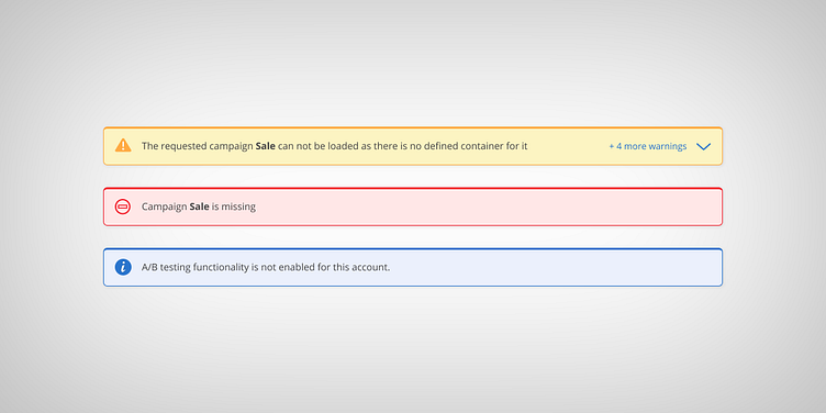
This particular type of notification consists of three possible scenarios based on the workflow outcome for the user. The messages are designed to be clear, concise, and easy to understand:
Notification (blue) - you need to see some information, but it is not crucial and you can continue without doing anything about it
Warning (yellow) - there is some important info you need to see and consider before continue with your journey. You need to be well aware what you are doing
Error (red) - hard stop, you can't continue until you address the issues mentioned in the text message.
