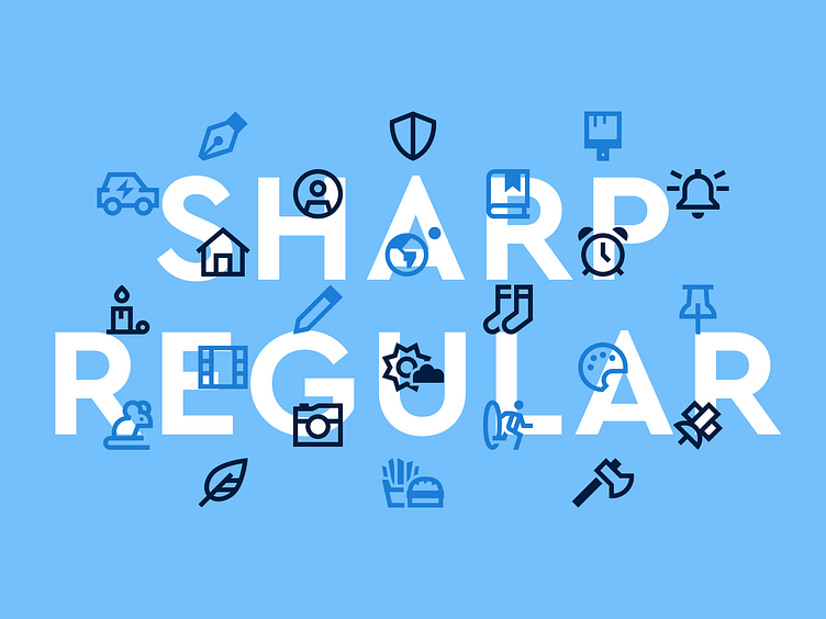
Font Awesome Sharp Regular
Last year we introduced the Sharp family of icons and sent Sharp Solid prancing down the runway looking fabulous. Now it’s time for Sharp Regular to shimmy onto the scene and into some new designs. But don’t be fooled. While this icon’s style may be called “regular,” there’s nothing basic about it.
Take a look!
Dress Up Your Project with Sharp Regular’s Laid Back Sophistication
Like Sharp Solid, the Sharp Regular icons are cut from the same cloth and highly adaptable for a clean, sophisticated look. They also combine well with the Solid icons you already know and love, to help reinforce different active states and modes.
Regular is also a great option for dense UIs where you need icons to pack a punch, while still looking sharp and legible on a light background.
Font Awesome Classic vs. Font Awesome Sharp
With the addition of the Sharp Regular icons, you’ll get an extra 3,000+ icons for your design toolbox, so you’ll be sure to have what you need to dress up your project with a look and feel that’ll turn heads.
And we’re not even done yet. We’ll be rolling out the remaining styles in Sharp throughout 2023 including Light, Thin, and Duotone. But Sharp is only available with a Pro subscription.
Along with Sharp icons, your Pro subscription includes access to Font Awesome Classic with multiple icon styles to choose from, including
Solid — Make a bold statement, even in small sizes.
Regular — Smooth out your design with easygoing, readable icons.
Light — Turn down the tone just a smidgen for when you need a lighter touch.
Thin — Style your site with the latest super-light designs.
Duotone — Go big with an illustrated feel by adding a pop of color.
You also get more Kits, pageviews, custom icon upload, Actual Human™ Support, and more!


