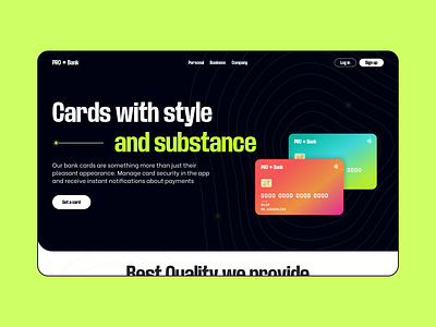
The concept of the bank's landing page
Everyone is used to the fact that bank websites are calm and restrained. And we decided to bend these rules and make an atypical page.
We started with typography — a wide and sans-serif font was chosen so that it could be easy to read, but at the same time emphasized the style and atypical. We also decided to highlight the string with an acid-green color, unusual for a bank, right?
Accent bank cards with a gradient were chosen for a cool composition, and lines resembling hypnosis were placed in the background. This is done so that the user focuses his attention on the central composition
More by Marina View profile
Like
