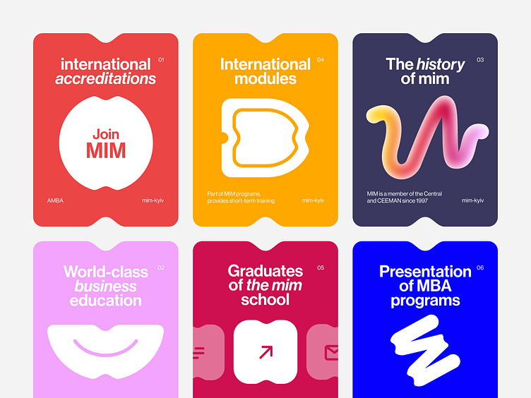
Branding style for a №1 business school in Ukraine | Lazarev.
😈 Devil is in the details. As a robust web design.
How about taking a look at the UI elements we came up with?
📌 But first, a brief recap — when we partnered with the ambitious business school MIM, our task was to redesign a website that would convey its top-tier education level and creative streak.
When the overall site structure was done, we moved on to the UI elements and details that brought the whole thing together.
So our team of designers went for a vibrant color palette that perfectly goes with the MIM's bold positioning — №1 business school in Ukraine and beyond. But we also added a dark blue background to balance contrasting hues and avoid straining website visitors' eyes 👌
Next stop — 3Ds. These fellas deliver volume to a page and grip people's attention as they cruise the website.
Oh, and one last important thing. Logo redesign.
We didn't forget about it. Of course, not.
Our team worked on multiple logo redesign ideas and decided to go with something simple yet aesthetically pleasing.
Aaand that was the last shot for this project but definitely not the last in our redesign portfolio 😉
Fellow design lovers, feel free to share your thoughts on this shot.
And if you have a project to redesign, don't hesitate to hit us up at hello@lazarev.agency
Website | Facebook | Behance | Linkedin | Instagram | Twitter

