Ticket booking app
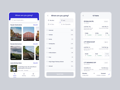
These are the three screens from a concept project in which a user book a railway ticket.
-----
Screen 1- Home Screen: At the top, there is a quick search bar which takes a user to the search screen. After searching, there is a popular destinations container that has a list of popular destinations with an attractive image. Below that there are nearby destinations container which shows the nearby touristic location based on the location of the user. At last, there are news which helps users to be updated on the latest railway news.
Screen 2- Search: This screen has four steps. Step 1 is the departure location, step 2 is the destination, step 3 is the date of travel, and step 4 is the number of passengers.
Screen 3- Search Results: This screen shows all the available trains based on the search. Each card has a train name as a heading and below that there is the approximate time of travel and next to the heading there is a train number. Below all that there is the time of departure and departure station along with the time of arrival and destination station. At last, each card shows the available seats which the user can click and proceed to book the ticket. The bottom bar shows what the user has searched.
