Email App - Quick Reply
About
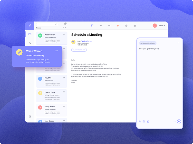
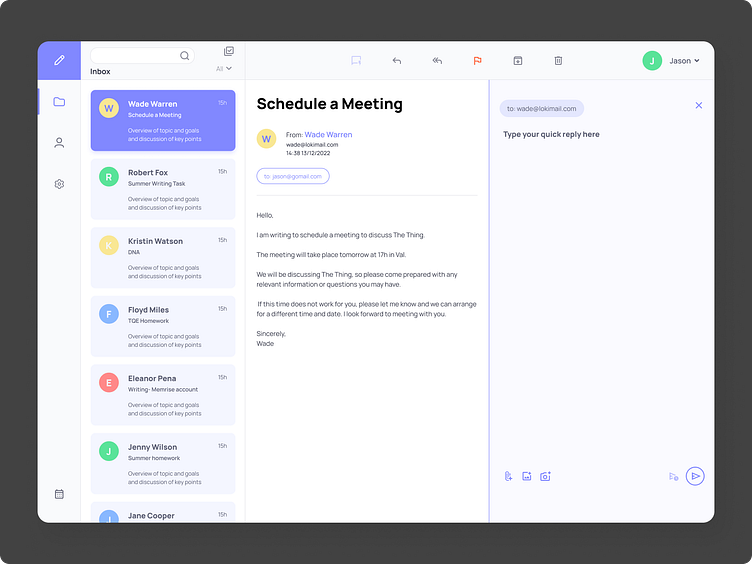
the main focus of this small case study was developing a Quick Reply functionality for an email app for desktop.

Based on our research of the existing app, we managed to track several problems and pain points.
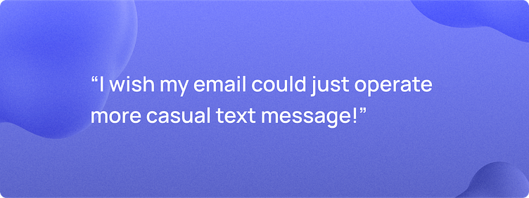
The main one was the formality of the replying process, based on most of the email applications on the market, and the lack of a direct messaging process that should be more related to a messaging app.
Persona and the problem statement
Our user persona named Leslie, an online entrepreneur told us that she hated the usual email applications. She needed a more casual type of reply.
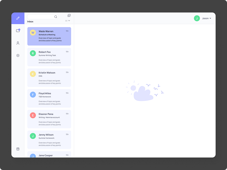
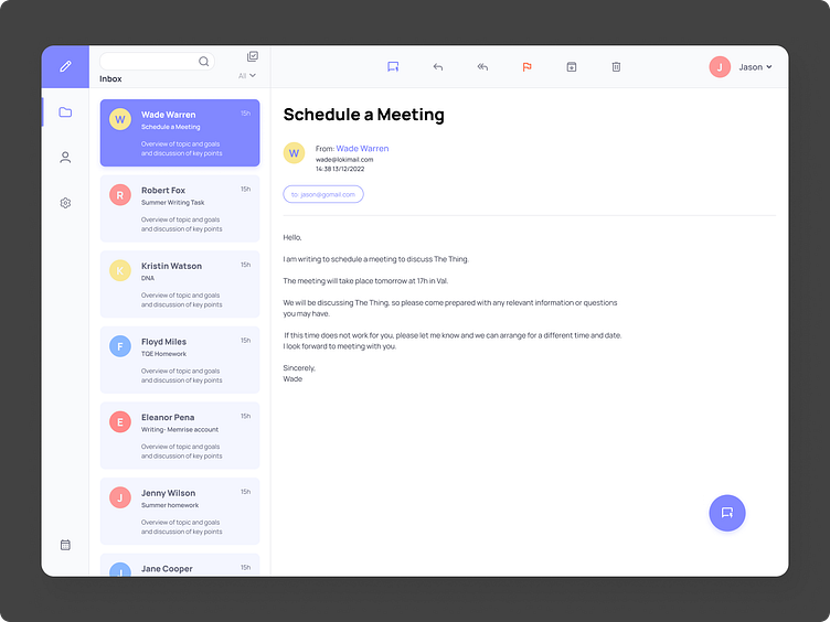
User Flows and Wireframing
So this was a starting point. We started to think about that simple Quick Reply function. The overall app should be clean, minimal, and direct. We started to think about the user flow and after that, the wireframes.
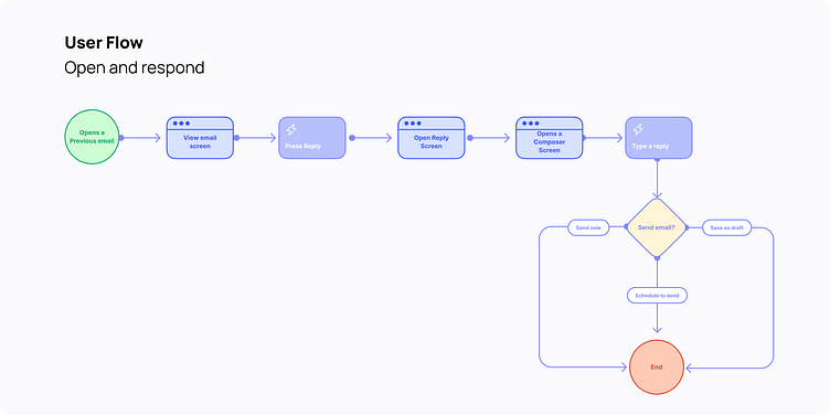
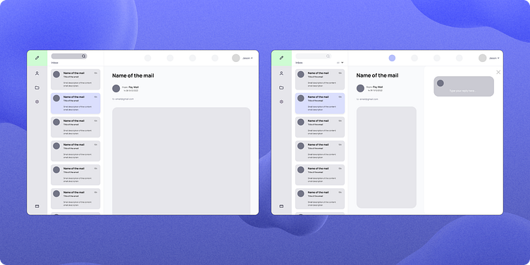

As said before, the three main objectives: are minimal, clean, and a direct approach to the reply screen.
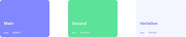
The colors
Look and feel
Exercise made on Dribbble Product Design Course.
