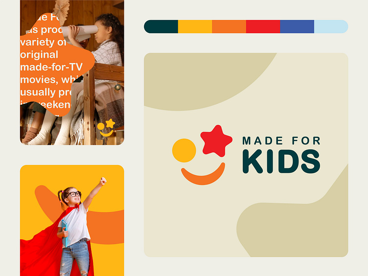
Branding for Made For Kids
What does this brand do, in your opinion🤔?
Creating branding connected to kids has to draw attention from both parents and kids👨👩👧👦. Kids should be interested in the logo, and it should look fun for them👧🏻. As for the parents, the logo must also say something about the brand’s values and goals that it helps them achieve🎯. For this reason, half of the logo is vibrant, colorful, and fancy, while the logotype is bold, affirmative, and soft❕.
The vibrancy of colors helps get the right attention from kids during studies👨🏻🏫, which is why this color selection remains effective for this purpose🎨. Meanwhile, the soft edges of the logotype evoke a caring effect, and the capital letter style gives a confident feel to the parents' eyes👀.
Let's work together!
— Do you have a project? 📩 projects@markaworks.com
— Visit our website to see all the project presentations.
