Horovod print materials
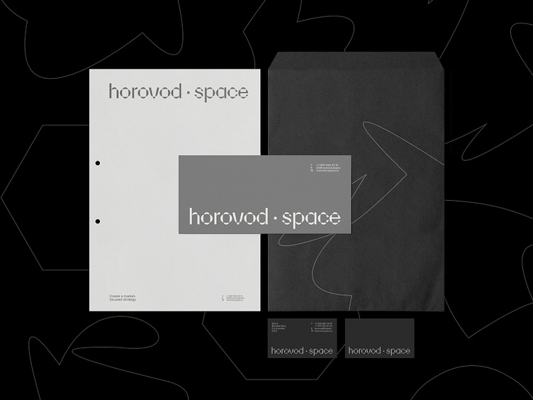
Horovod.Space is an ecosystem for territorial and real estate development offering modern strategies and solutions in marketing, technology, and architecture. To highlight their fresh approach to development, we’ve created a visual language that builds on the meaning behind the brand's name.
On each medium, a new “horovod” is formed from several points that are dynamically spun to create unique shapes within a single visual system. We use typography and colour coding to make each of the brand's many projects and directions stand out.
To keep the brand identity consistent across mediums, we adapted horovod.space's new visual language to their logo, website, social media templates, and merchandise.
Learn more about this project!
| ESH gruppa | Instagram | Behance | LinkedIn | Twitter | Pinterest |