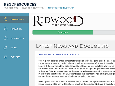
IRA Dashboard Revisited
Just couldn't put my finger on what felt wrong until this weekend when I was looking at it. Definitely think the different font cleans things up a bit, as well as some sizing issues.
More by Aaron Nichols View profile
Like

