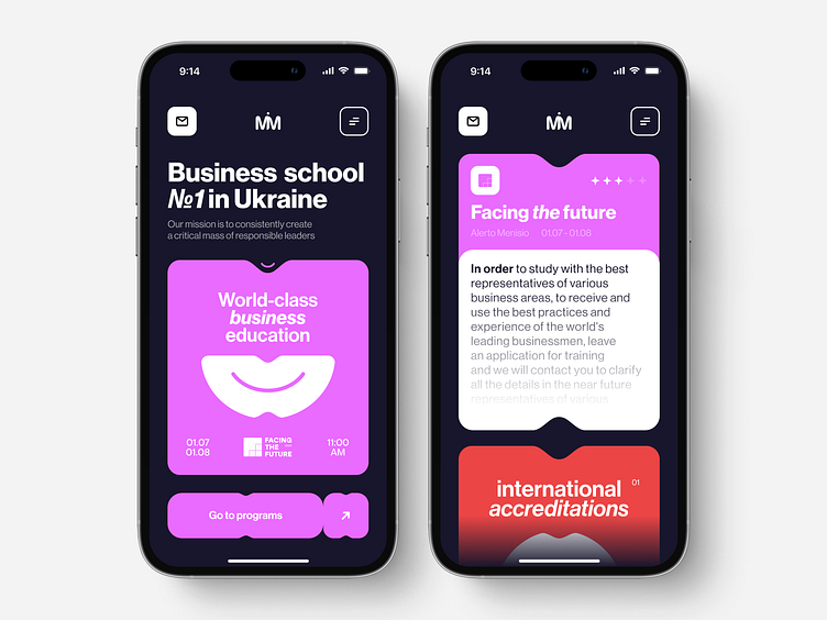
Business school website redesign for mobile use | Lazarev.
Buckle up, Dribbblers, cause we're moving on to the website redesign shot №2 😎
If you haven't checked out our first one, make sure to do it.
Let's go! 🏃🏃🏃
📍 Fact about us — we're all about comfort and accessibility. And our designs are no exception. Because who doesn't want to surf a website on the go or just curl up on a soft coach? Even when you choose a business learning program, right?
So here we kept the core UI/UX elements of the website we redesigned — its dynamic and bold shapes and colors. Our designers ensured smartphone-first site visitors navigate the site as smoothly as possible while enjoying eye-catching details.
We also focused on textual content so that people exploring the page would learn about the business school's offers and find the right program or event to enrich their knowledge.
This is the second of the shots we've prepared for this project.
One more to go 🔥
But for the time being, let's talk. Share your feedback on this site redesign.
💌 Have a project you need to revamp? Contact us at hello@lazarev.agency
Website | Facebook | Behance | Linkedin | Instagram | Twitter
