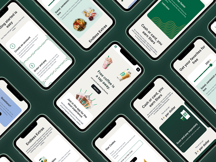
Simplifying the Starbucks Rewards Experience: Mobile Redesign
Hi! 👋
Excited to share the redesign of the Starbucks Rewards page for mobile screens!
The aim was to simplify and streamline the user experience, making it easier for customers to understand what rewards are and how to redeem them.
Take a look at the screens below and let me know your thoughts!
Say hello: sevginurak@gmail.com
More by Sevginur Ak Parlak View profile
Like


