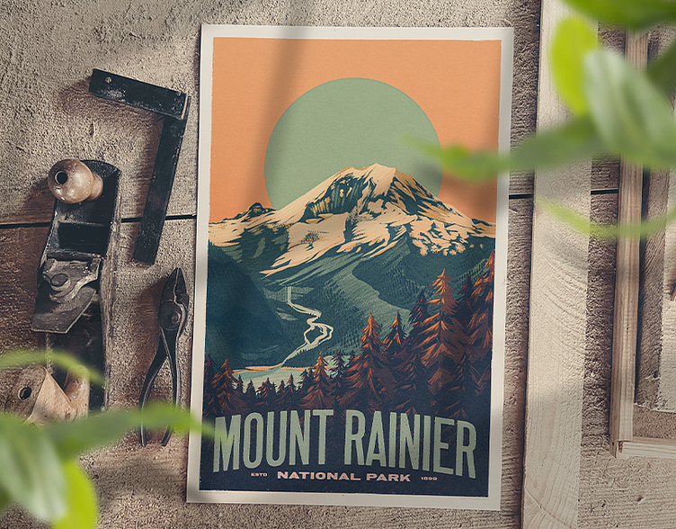
Mount Rainier National Park
Here's a poster I recently illustrated. I'm a big fan of national parks posters from the 1930s and enjoy taking a crack at that style through the lens of my own sort of illustrative vibe. Rainier's always a compelling subject, so I chose it as the first in what will be a series of posters focusing on travel and landscapes.
As is typical for me, I did most of the illustration work in Procreate. The typography was all thrown together in Illustrator. Then I toss that all in the mix with Photoshop and do some adjustments as needed. Then I finish it all off with some crafty color work in Lightroom.
As I have mentioned on here before, Lightroom is a big part of my secret sauce for getting my illustration colors right where I'd like them. Shhh! Don't tell anybody!
The rough sketch and then what I would refer to as sort of a color blocking phase
The full design


