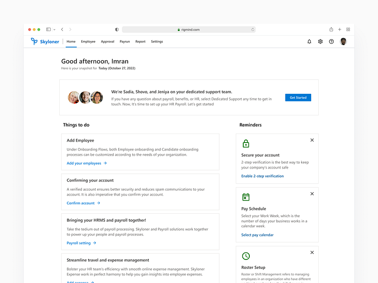
HR Dashboard Empty State
👉For design empty state of dasdhboard, determine why the dashboard is empty and what action(s) the user should take. Define the message: craft a clear, concise message to communicate the purpose to the user. Choose an appropriate visual: select an appropriate visual, such as an illustration or icon, to accompany the message.
👉Keep it simple: Keep the design simple and uncluttered, using only the necessary elements to communicate the message.
👉Provide clear call-to-action: Provide a clear call-to-action, such as a button or link, to encourage the user to take the desired action.
More by Imran Uddin View profile
Like


