Dashboard Design
The UI/UX design of Hyper Print's Dashboard
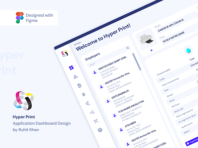
The UI/UX design of Hyper Print's Dashboard was a game-changer. The previous design was outdated and lacked the aesthetic appeal that users expect from modern software. However, with the redesign, the dashboard now boasts a clean and modern look, making it much more user-friendly and appealing.
The new design features an intuitive layout and clearly defined elements, making it easier for users to navigate and find the information they need. The updated graphics and color scheme contribute to the overall sleek and polished appearance of the dashboard, making it a joy to use.
Te UI/UX redesign has truly elevated the Hyper Print Dashboard to the next level.
Follow for more Exciting Designs.
