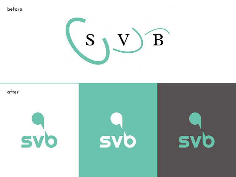
#8 SVB - Sociale Verzekeringsbank
Country: Netherlands
Industry: Government & public services
What they do: “We implement Dutch social insurance schemes, for example, for AOW old-age pension, child benefit (AKW), or the personal care budget (PGB). We make sure that our clients are aware of and receive what they are entitled to, correctly and on time. We help them as quickly as possible, the first time they contact us.”
Process: The Dutch SVB is a perfect example of a government agency that needs a rebranding. The premises are inspiring and uplifting: this entity seems to truly care for dutch citizens to receive financial support, implements open dialogue between its employees, and it’s even open to question the law, if the law is not of service of its citizens. This is in stark contrast with the usual government agency. We even find more women than men among its employees.
Words: righteous, collaborative, collective.
Result: “Dialogue” was the central concept for this brand, bringing together collaboration, care, and service to the collective good. The main symbol embodies just that, a simple quotation mark that starts a conversation which is carried on onto the brand workmark; Righteous was the font chosen for the new SVB wordmark, pun intended.