PHOTOGRAPHER PORTFOLIO
PHOTOGRAPHY PORTFOLIO
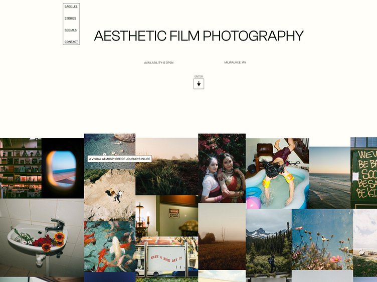
A minimalist portfolio website that collects a collage of images and displays them as the backdrop to create a unique experience for the end user. Featured images/stories are highlighted in their own grid, leading to external links for user conversion. More specifics about this design are down below ↓
Figma links:
LANDING
Bringing emphasis to user scroll, the idea of moving elements came to mind. The navigation menu will follow the user to the bottom of the website giving them anchor points to quickly jump around with. In mobile view this navigation will be horizontal on top of the screen rather than on the side following the same sticky anchor functionality.
In the body's first paragraph element, we will also see another moving component that follows the user's scroll. This track is shorter but gives more life to the gallery behind it.
SPECIALTIES & STORIES
We highlight the main purpose of the creative with a list of specialties/services and a grid of projects. Each element contains a narrowly edged block to separate it from the collage in the background. Again, the idea of the project links is to externally transfer the user to another source, such as an Instagram post, Dribble link, etc. Also included is a list of previous/archived projects that a creative may want to highlight but not necessarily put on a pedestal.
CONTACT & SOCIAL MEDIA
Following the simplicity of the website, we have a simple contact section that allows the end user to email or get specific social media links.
USERS
Thinking about the demographic that may be important to a photographer/artist, three personas came to mind. A buyer, collaborator, and hiring manager.
STYLE GUIDE
To keep things simple I ran with a three color palette and a two font typeface. Also a 12-grid column was utilized for the desktop design and a 4 grid for mobile design.
WIREFRAMES
When I create wireframes I like to draw them out first. Its a quicker and effective process for me to do that and translate them onto Figma.


