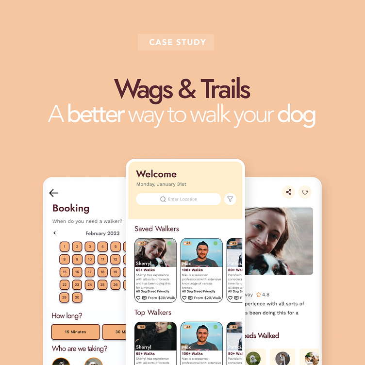
Wag & Trails: A Dog Walking Case Study
Overview
There are so many Dog Care apps in the market such as Wag and Rover. Each of them carved out a huge chunk of the On-demand Pet Care Market. However, the one thing they failed to do is build a trustworthy, long-term relationship between the Dog Carer, the Dog, and the Owner.
This case study serves as an exploration to change the dog walking experience. The goal is to connect dog parents to dog walkers, who will take care of their furry one line their own in urban areas.
Problem Statement
The target user's age was between 18-25. This demographic can be characterized as active, social, and extremely caring towards their furry friend. After having conversations with multiple potential users, the problem was clear. Trust and lack of transparency about the walker have caused a lot of dog parents to stay away from dog walking/caring apps.
1. They believed Walker's persona didn't translate into the real world
2. The process of finding a dog walker and retaining the same walker is increasingly difficult
3. Dog Parents want to stick with 1-2 dog walker rather than multiple, so they don't have to go through the vetting process every single time
Role
My role in this project was to research to gain clarity and understand the pain points of the user to solve this problem, ideate and prototype a solution that is catered to address the pain points, and finally test, refine, and deliver the solution. With the help of other designers, we were able to share our user research and market reach to understand the problem at a granular level.
Market Research
Persona
User Flows
When constructing the user flow, one must keep in mind of the user experience. The user is the most important stakeholders to the Product Design process as it's the foundation to the entire digital solution. Carefully thinking through each user flow allowed me to ensure I was addressing the pain points stated by the user to avoid the Build Trap. The main problem at hand was "How do I solve the facilitation of trust between the walker and the owner?" By building the user flows from various start points, I was able to address any bottlenecks to this pain point.
Wireframes
Low-Fidelity Wireframes
Being able to construct low-fidelity wireframes was the most fun part of the course. FigJam allowed me to instantaneously bring out my thoughts and ideas to life without the need of mastery of any tools. The virtual pen and paper allowed me to incorporate key elements from the user flow.
High-Fidelity Wireframe
High Fidelity wireframes served as a light blueprint to what the solution would actually look like. This allowed me to start thinking about key components that user would find useful.
Visual Designs
Prototype
Better to show than explain. Here is a link to my prototype!
Allowing users I interviewed to test this app helped a ton. I was able to catch the most smallest mistakes or problems through testing which allowed me to go back to the prototype fix those problems.
Conclusion
Enrolling in the Dribbble Product Design course allowed me to explore my interests in building a digital product. More importantly, I was able to finally understand that the Design Process is not a step-by-step playbook, but more of a mentality that can be used anywhere, anytime. I am so glad to have wonderful mentors and classmates to make this a fruitful experience. For me, this is my first step into moving into the product space and I am glad I was able to spend my 16 weeks with Dribbble to learn from the best in the most fun way possible.
Special thanks to Valerie Downs for being a great mentor and really sparking my interest in Product Design.


