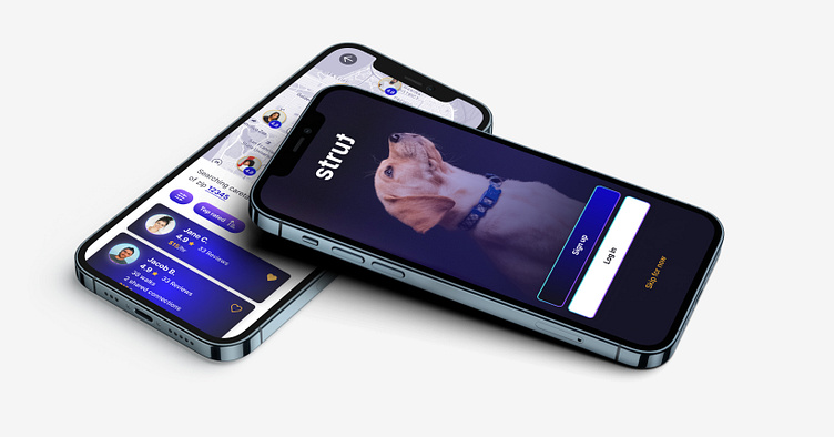
Strut - A pet care case study
Welcome to Strut, a fictitious pet care app that was created as part of Dribbble's Digital Product Design course.
Project Overview
Project brief
The goals of this project were:
1. Go through each step of the product design lifecycle: Research; Define requirements; Ideate; Prototype; Test; Handoff; Measure.
2. Build a trustworthy app that seamlessly connects pet owners with caretakers of any kind—walkers, sitters, trainers, and more.
My role was to go through each step of the UX/UI process in order to design an app experience that delivers on these goals.
User research
Interviews
My first step was to interview dog owners and caretakers, as a means of understanding the goals and pain points of each group. Interviewees were people who both had and had not used pet care apps in the past.
As a group, my classmates and I also brainstormed on the potential problems and risks involved with leaving your pet in the care of a stranger. We also kept an eye on how to help caretakers stand out with their profile, ratings, and reviews.
Market research
I next examined two competing apps in the pet care space, keeping in mind the themes of trust, ease of use, and how well each app addresses the goals and frustrations that were frequently mentioned by pet owners and walkers.
Personas
Based on findings from the interviews and competitive analysis, I created two personas as proxies for the target users of Strut.
User flow
The information gathered throughout the research phase served as the foundation for the user flow, which mapped out the actions and decisions that are available to pet owners and caretakers when they are onboarded and searching for care.
Ideation / Wireframing
Multiple rounds of wireframing were required to test the viability of the user flow. I focused on designing two phases: onboarding a new user and helping him/her search for care services. Wireframing was a critical step in the process to ensure that the user was never presented with too much or too little information.
Low-fidelity wireframes also allowed me to (quickly) envision how to weave trust throughout the entire experience with the use of language, recurrent iconography, and features that showcase the experience and competence of caretakers.
Visual design
Visual identity
Now it was time to bring things to life. I started by curating a mood board that served as a springboard for building a visual identity system. Vibrant colors became a key element in the system to lend a feeling of vitality to Strut.
Design mockups
Once the color and text styles were set, it was time to flesh out the aesthetic and user experience with high-fidelity mockups:
Design system
As screens materialized, I began building and organizing an initial component set for repeating design elements. This step was critical to expediting the design process and ensuring consistency and scalability amongst the designs.
Prototyping
The final step was to create a prototype of the mockups, both for testing purposes and for presenting functionality to users.
The prototype can be viewed here.
Conclusions
My primary goal was to learn Figma, but understanding the UX/UI design process will be just as critical to my success as a digital product designer. Going through each step of the process forced me to organize my thinking in a way I hadn't before with a framework that simply cannot be overlooked when trying to address the goals and frustrations of users.
This project also reminded me that at its core, design is first and foremost about problem-solving. And while there are seemingly endless possibilities for solving problems with creative solutions, as a product designer, if I stick to the design framework, prioritize user feedback, and test proposed solutions, then I can maintain focus on providing the best possible user experience.
Thank you!


