Galahad Browser App Case Study
In answering the challenge issued by dribbble's weekly warmup (design an app icon for a new web browser), I found an opportunity to document my processes for brand creation. This case study serves as that documentation!
My solution to recognizable branding is to ensure that the brand is, at all times, answering the question that its product seeks to solve. In this instance, the question I posed was "What might persuade people to switch a different browser?"
As user privacy and safety dominate the forefront of internet conversation, I found this to be the most obvious answer. Once I had a beginning concept, it was time to find associated words that could evoke my solution.
Picking a name from one of the Arthurian knights allowed for a fun touch of recognition and curiosity for the potential users and began to steer the app in a firm direction towards identity.
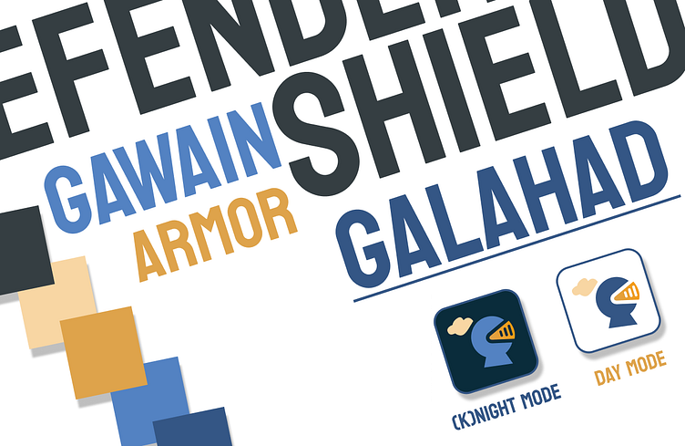
I had initially conceived of the brand name being placed diagonally as shown above, to create the shoulder and breastplate of the knight icon, but ultimately decided against it for the icon.


