Branding: logo design for an ice cream brand
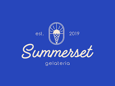
The sign is divided into 2 parts - the sun, as a symbol of summer, which associatively leads to enjoying ice cream, and a cone in the form of a waffle, to understand that this is an ice cream brand. The central line is the horizon behind which the sun sets, which reproduces the sunset.
For the main font, I chose handwritten, it perfectly conveys the vibe of summer, is basic, and will always remain relevant. It very clearly distinguishes and separates it from all competitors in the Ukrainian market, which will give + to memorability.
All shapes and fonts in the logo are rounded, which subconsciously shows the friendliness and kindness of the brand and says: "we are stylish and friendly, try our ice cream!"
