Roger - Dog Walking App
With an increasing number of people owning pets, there is a growing demand for dog walking services. Roger offers a unique solution by connecting pet owners with local, vetted, and reliable dog walkers at the touch of a button. For busy dog owners, finding a service they can trust and rely on is crucial. That's why our dog walkers undergo a rigorous vetting process to ensure they are qualified, experienced, and insured.
Real-time tracking and communication system gives owners the peace of mind they need, knowing that they can stay connected with their pet and their walker at all times. Trust and reliability are our top priorities, so you can be confident that your furry friend is in good hands.
Design Process
I was responsible for the end-to-end design of a dog walking service for busy dog owners. My objective was to create a user-friendly and visually appealing platform that would allow users to book and manage dog walking services with ease and convenience, while ensuring that the app was accessible and usable for people with disabilities and different levels of technical proficiency.
I conducted thorough market research to understand the current market trends, competition, and target audience preferences. I also conducted user research to understand the pain points and requirements of dog owners. Based on my findings, I designed a clean and intuitive interface that was easy to navigate and use.
User Research
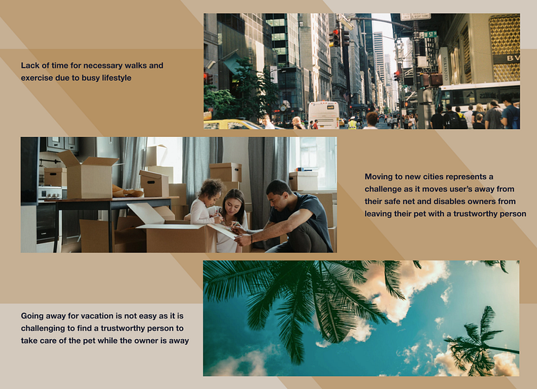
My user research was mainly focused on interviewing dog owners and asking about their experience with dog walking services. I discovered that busy dog owners need a service that they can trust and rely on, and they want to be able to book and manage the dog walking services with ease.
Additionally, they want real-time tracking and communication features that allow them to track their dog walk and communicate with the walker through the app. I also found that the dog owners want an app with a clean and intuitive interface that is easy to navigate. Furthermore, the app should be accessible and usable for people with disabilities and different levels of technical proficiency.
Market Research
As part of my design process, I conducted market research to understand the current market trends, competition, and target audience preferences. My research showed that there is a growing demand for dog walking apps, as busy dog owners are looking for convenient, reliable, and affordable services to help care for their pets. The market is competitive, with several established players such as Wag and Rover, but there is also room for new and innovative services to enter the market.
Persona
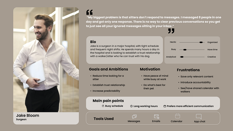
The ideal customer for a dog walking app would be a busy dog owner who values their time and wants a convenient and reliable service to care for their pet. They have a strong attachment to their dog and are willing to invest in a high-quality service that provides peace of mind and a stress-free experience for both them and their pet.
This ideal customer is likely to be tech-savvy and appreciate an app that is easy to use and visually appealing, with a clean and intuitive interface. They want real-time tracking and communication features that allow them to keep track of their pet's well-being and communicate with the walker through the app. They prioritize their pet's well-being and comfort, and they want a dog walking service that they can trust and rely on.
User Flow
While working on user flow I considered the user's goals and pain points and strived to design a smooth and seamless experience for them. I made sure to include key elements in my design such as:
A clear and simple sign-up process that allowed users to easily create an account and provide information about themselves and their pet.
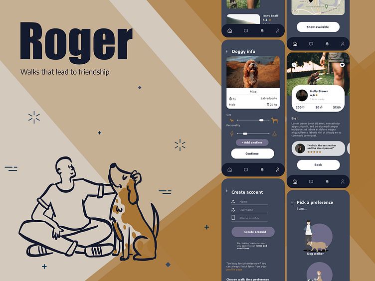
An intuitive home screen that displayed the available dog walking services, making it easy for users to select and book a walk.
Real-time tracking and communication features that kept users informed about their pet's well-being during the walk.
An easy-to-use interface for communicating with the walker directly through the app, giving users the ability to provide additional instructions and ask questions.
A summary of the walk, including a report on the pet's behavior and any special needs that were addressed, to give users peace of mind and a complete picture of their pet's experience.
A rating and feedback system that allowed users to provide feedback on their experience, helping the dog walking app to continually improve the service.
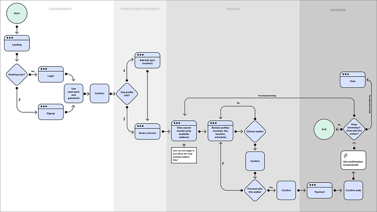
Here's an example of a user flow for a dog owner going through the process of booking a dog walking service:
Moodboard
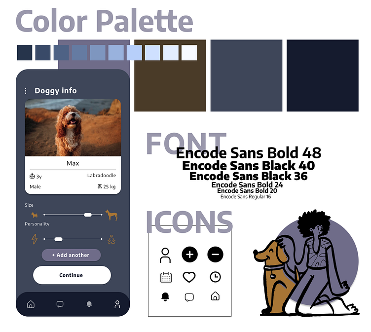
Inspiration for the visuals came from my childhood favorite "101 Dalmatians". I curated various sources into a collage of images, colors, and patterns that reflected the desired mood and style of the app (see below). The moodboard also helped compare several contrasting visual styles, and served as a reference for the stakeholders, ensuring that the overall look and feel of the app was consistent throughout all elements of the design, such as typography, color palette, and iconography.

Wireframes
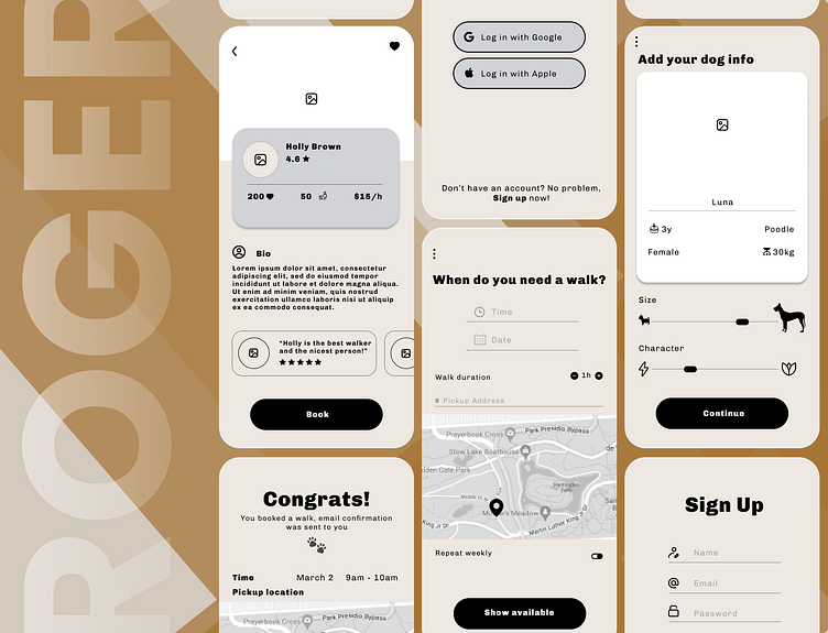
I started by mapping out the user flow and identifying the key screens that were crucial to the design process. These screens included the sign-up screen, the home screen, the booking screen, and the tracking screen. To ensure that the design was intuitive and user-friendly, I focused on three key areas: tracking on Google Maps, an intuitive selector for dog size, and an easy-to-use date and time selector.
Additionally, I considered feedback from stakeholders and explored different design options, such as having a separate "confirm booking" page, which was a departure from the original design. After creating rough sketches of each screen and focusing on the placement of interactive elements such as buttons and inputs, I reviewed and refined the wireframes. I then moved on to creating high-fidelity mockups and prototypes that incorporated the visual design elements and branding.
Visual design
In order to fine-tune the design direction, I built multiple versions of the screens and iterated over several ideas to arrive at the final prototype. Throughout the design process, I gathered user feedback to ensure that my designs were always aligned with the user's needs.
One of the key screens I focused on during the first visual exploration was the dog walker profile screen. This screen was important because it presents some of the most critical information, such as the dog walker's qualifications and experience, which helps users make an informed decision about who they want to hire. Additionally, this screen features most of the components I used throughout the app, making it a good starting point for testing different color palettes, fonts, and visual styles.

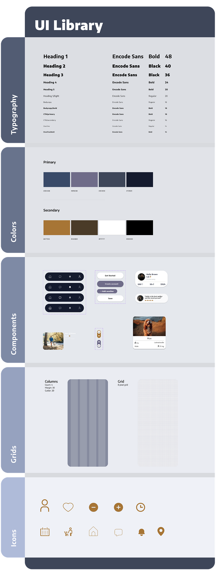
UI Library
To allow future work and improvements, I organized all of the visual components into a UI library together with typography and color palette. I built a UI library that acts as a design foundation for the entire project. The UI library includes all of the necessary components, such as buttons, icons, typography, color palettes, and more, that are used in the app.
Prototype
Creating a high-fidelity interactive prototype enabled me to validate my design assumptions. With my background in software engineering, I recognize the significance of having well-defined designs before beginning app development.
To see and interact with the prototype, click [HERE].
Feedback and testing
I believe that it is crucial to continuously gather feedback even after the design has been finalized, to continuously improve the app. To ensure the best user experience, I gathered in-depth user feedback on six different home screens.
Based on the feedback, I focused on two favorite screens and used them as a basis for designing the rest of the app. I created two different design variations, and gathered further feedback to make sure that I was on the right track.
Outcomes
I strongly believe in an iterative design approach; to illustrate, I started by creating two moodboards with contrasting styles: one light and playful, the other dark and enigmatic. This allowed me to define the color palette and create additional moodboards that lie between these two extremes. With the moodboards, it was much easier to make informed decisions and move on to wireframes and high-fidelity designs. The highlight of the experience was constructing and testing the interactive prototype of the app, receiving valuable feedback and seeing it come to life.
About me
I see myself as a clash of two worlds - design & engineering. I am currently working as a software engineer at Google, but I studied interior design & architecture, hence I am a lifelong aficionado of visual arts. I was always passionate about clean design and intuitive user experience, and some of my engineering work allowed me to take features from wireframe to production, to being used and enjoyed by hundreds of thousands of people.
