Solutions crafted for a US brand
Giphy sticker by Idil Keysan for the Wikimedia Foundation - 2019
This post delineate my work done during my part time at Scord Consulting, a firm based in USA.
My role
UX Designer
Well, I solved problems on the UX front and delivered some cool UI, with all the wireframes and prototype
Experience
First times are etched in the heart forever. I was so happy and excited that the solutions I have crafted are for the US market. This was a challenge in itself. Being an Indian resident, I had to put myself in their shoe and align my thoughts with the US audience. Taking interviews, connecting with my leads and reading about the habits and culture in the USA helped me to bridge this gap.
In fact, this was the first time I got to learn about slack and Jira. This was a new experience and I like a kid was happy and excited to get to learn about more platforms that are used by the design team worldwide.
Ps: This project was all about recipes and grocery and omg! I am a big-time foodie. Zomato and Swiggy sales must have topped the chart during this time as I was ordering like a hungry-cheese addict lol (but seriously, I got plumped during this project)

Yeah let’s get back to business (Ps: I hope you got a lil smile there :P)
Introduction
Before starting out, I will clear out a few things, since my work is under NDA, therefore I am only allowed to share my work solutions without taking the name of the actual company for which it was designed.
I worked on building designs for a recipe store. This online grocery store-recipe site is developed to solve the problem of working people and housemakers. It was found in the US that these people want to save time and find it difficult to decide what to cook every day. The solution was crafted keeping in mind the needs and pain points of such people. The site will have recipes, and meal-planned charts and once the recipe is decided, the users may add ingredients to their basket and which makes their task easy. It was also found that users buy unnecessary groceries because they don’t really know what to cook and often that gets wasted. With this new service, the users get ingredients per meal. Once the ingredients are in the cart, the nearby sellers having these items get the order and they deliver it to the doorstep or can be even picked up by the user.
The site has two different experiences — the recipe site & the grocery store.
Problem statement 1
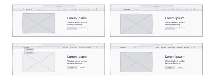
As a user, I am on the grocery store's site. I click on recipes and I get taken to the Recipe site. The recipe site is branded with the grocery store's logo in the top left-hand corner like standard navigation should be. If a user clicks on that, would they expect to be navigated back to the grocer's site? Or would it navigate them back to the recipe’s site homepage?
Solution
My initial thoughts were: Why do we need to give these two experiences together? Why can’t users log in and see the recipe site and use the back of the browser to get to the grocery store? Can’t we show the grocery store only at the time of checkout when users have added grocery items to the cart? Will have an option of switching to two different environments not confuse the users?
The suggestion of a backlink/home icon next to the logo was designed. This would allow the user to clearly know what they need to click to go back to the grocery store site vs the recipe site homepage. The second idea was to have 2 options 1- recipe home and grocery store embedded within the logo that would drop on the click of the logo. Another idea could be a home text link within the nav tab to distinguish between the use of a logotype that would take them to the grocery store and a home text link that would take them to the recipe site.
They needed a simple solution that allows a user to navigate back and forth between the two experiences nicely.
Problem statement 2
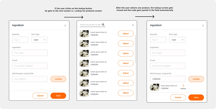
When adding ingredients to a recipe using the Recipe Wizard, we need to fetch a UPC/Product code (if not already known) from the Freshop API so we can attach product codes to every ingredient for faster experiences for the shopper.
The creator might already know the UPC so they don’t always need to look up a product. There should be a Lookup button/function and a remove button/function in case they change their mind they don’t have to recreate the ingredient just to remove the product code.
Understanding the problem
Currently, the user gets a variety of options for a single product and decision taking for each ingredient takes a lot of time which may result in a drop-off rate and frustration because of the inability and uncertainty of choosing the right product.
So the idea here is when the recipe creator is adding an ingredient, he can add a product code if already known or might look up the button if he needs assistance. Now, the list of options that was earlier shown to the buyer will be shown to the creator also to choose a particular brand for a grocery item and now the user will see the ingredient list with products too if they like the suggested products of the creator they can add the same or change it if they want. This small step would save a significant amount of their time.
Solution
Rough ideas sketched on paper to get the creative juice flowing
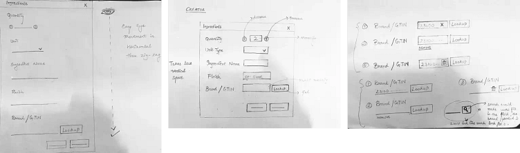
I had multiple questions before beginning this design ticket. One of them was if the Product code has some particular digit. Our mobile number has 10 digits and that is constant throughout. I realized that we can break up the code into segments as we do with mobile numbers. +91 (India code) 000–000–0000. On asking the same, I got to know there is no particular format for product code right now and that the break-up won’t make sense.
I made the zig-zag style first then I realized that vertical alignment would be great for the user's eye would move easily from top to bottom. But left and right fields have a plus where less space is occupied in terms of vertical layout.
I could have used the search icon or button instead of the lookup button but that would have confused the user and they would have entered the product name instead of the product code and clicked on the search icon to look for the brands available. So I crossed out that idea.
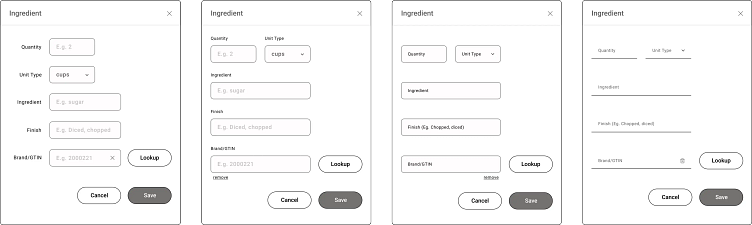
Iterations- Lo-fi Wireframes
Hi-fi Prototype of final selected design
Problem Statement 3
In order to manage the recipes in the suggested section easily, we need a GUI interface for the API in order for non-technical people to manage what is surfacing in those respective sections. Management means being able to add/remove/adjust the recipes in the respective sections and the timers related to those sections.
Acceptance Criteria:
Be able to view (list view) all recipes in their respective section
Be able to view the timer value
Be able to adjust/modify (and save) the time value
Be able to add/remove recipes from the respective sections
Sections include — Content (featured, seasonal, favorite, history and cart) & Tags
It is a CMS type feature that lets the admin configure what kinds of recipes they are suggesting to the user.
Solution
Initially, I was quite confused, I had so many questions in mind and arranged a meeting with my manager to understand the exact requirements. I was confused as to what they meant by timer value.
So the admin will want to know how much longer a recipe will be featured in a particular section of the site. A date + time stamp would be helpful to indicate how much time is left.
Basic requirement as I understood was:
A way to see the 5 sections- featured, seasonal, favorite, history and cart
A way to add recipes from a list to these sections
And a way to see how long they are up for with the timer
The challenge was to integrate all these sections within one page and let users swap among different sections easily. This needs to be easy to understand and all the sections should be easily to navigate.
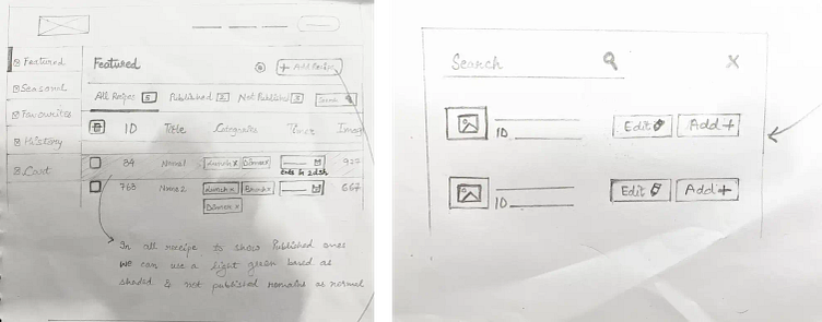
Initial sketches to draw a rough layout upon which multiple iterations were done
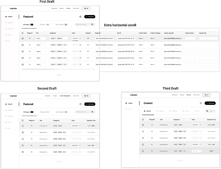
These were different wireframes at different stages after review sessions
After the second draft, it was decided that there is no need to segregate recipe based upon their status by another nav bar and to integrate the status within the expiration time category. The purpose was not to overwhelm the admin/creator with a lot of unnecessary information and to make the screens sorted and their work efficient.

Design as finalized. This structure would serve as a good option when in the future more sections need to add in the left sub-navigation
Problem Statement 4
As a System Admin, we will need the ability to modify/add/remove tags from a UI so that non-technical people can manage the system. This will be another tab on the Admin’s login account. The tab will be named Recipe Tags. Will need to be able to perform the following:
View all tags in respective categories at once
Ability to Add new tags in any category
Ability to Remove a tag/s from any category
Ability to Change an Existing tag from one thing to another (Edit tags)
Example: Change Dinner to Main-dish
The Tag categories currently are:
Meal Type
Cuisine
Diet
Allergies
Solution
The brief I got suggested the tags should be in another category like manage within the top navigation bar. And the 5 sections were added loosely on the left nav panel.
I felt that the top nav would become too cluttered and for that, I suggested we keep the 5 sections under one common section i.e. content and another section as a tag. I felt the purpose of editing, adding, viewing and deleting tags can be done in content management only, plus it would not create a spacing issue in the top nav. I designed the IA again and submitted it for approval and once it was signed off, I created the designs with a new left nav panel.
The challenge was that users should be able to edit those tags and that editing tags should be easy too.
The initial idea suggested to me was to allow a user to select a tag and then show a button or action once the user clicks on the tag.
According to me, I felt that the majority of users won’t go ahead and select a tag they will just add or delete it and the above flow would be a bit confusing. If we see the heuristics of consistency and standards, the users know that they can either delete or add tags as per standard across all the platforms when tags are concerned.
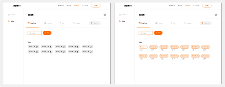
The designs were made as per the editable tags requirement
Problem Statement 5
As a Shopper, I would like to have complete meals suggested to me for the week so that I can complete my meal planning faster.
Focused on the actual meal planning function. 5+ Day plans. Main dish plus 2 side options.
Features Plan:
Ability to send whole meal plan to cart in a single click
Add additional meals to the overall plan
Click into individual meals to swap items with ones from a global catalogue
Review the revised meal plan
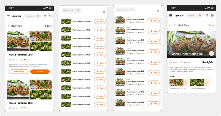
Solution
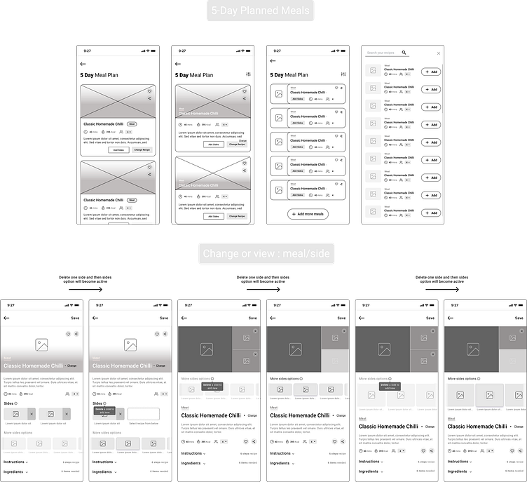
Mobile responsive screens. The app for this service will be considered in the later steps. This is the work for MVP release.
The feedback was that they wanted sides images as well as image of the main dish in the card itself one the 5-day meal planning screen. Another suggestion that came up during one-on-one discussions was to have some visual indicators with change recipe and edit sides like we have for like and share. But I felt that having icon and no text for edit and change otherwise would confuse the user with the question if the edit and change is for sides or main or both. An icon alone is not informative enough. Therefore, having a textual button made more sense.
One use case that I could think of and was not covered was where a user removes one side while editing and saves the meal, because he wants one main dish and one side dish. Questions like — what about if the user wants to have just one side & Is it important to have both sides? bubbled up in my head. I got my doubts cleared and the current requirement was to have two sides along with a main dish as mandatory.
Hey, I know people usually say brainstorm in the lo-fi wireframe but this was new and exciting too :P
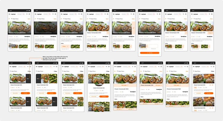
I tried to wrap my head around the problem and design as many iterations as I could within the time frame of the ongoing sprint (deadlines vs. designers, ikr lol). If you look closely many of them are redundant and after making these I analyzed them and found some might confuse the user, some might take a toll on the aesthetic appeal (which too needs to be taken care of). I along with my senior designer chalked out the final ones so that we can further iterate upon those and then delivered the interactive prototype.
The designs that were picked up as final by the leads
Other Problems I solved
1. Selecting appliances — Statement: Need to attach respective appliances that apply to the recipe from a list of predefined appliances during the Recipe creation using the Recipe Wizard.
2. Adding recipe videos — Statement: Creators/Grocers are leveraging more and more videos to promote or explain their recipes. We need the capability to have videos (hosted on third parties such as YouTube or Vimeo) to be displayed in the Full Recipe card view. Initially, it will be limited to one video but could eventually lead to videos that complement the steps (creation) of the recipe.
3. Recipe status check for creator and admin— Statement: This is part of the recipe approval process. There are two parts to this, Creator and Admin.
Statuses:
Submitted — the recipe is created and in the system waiting to be reviewed by the Admin
Approved — the recipe has been reviewed by the Admin QC process and is able to be published
Rejected — the recipe did not pass the QC process and is passed back to Creator to fix
Unpublished — recipe has been approved but the Creator has not made it available to the public yet
Published — the recipe is visible to shoppers
Creator: The Creator puts the recipe into the system using the Recipe Wizard and “submits” the recipe on the last step. Upon completion of that, the recipe will be in “Submitted” status.
The Creator will have the ability in their panel to see the status of (Rejected, Unpublished, and Published).
They will only be able to change the recipe status between Unpublished and Published
Admin: The admin reviews on a regular interval all recipes in the “submitted” status for quality control via the admin panel. If everything looks good, the admin will approve the recipe and it will be set in the “Unpublished” status. If not, it will be set in the “Rejected” status.
4. Ingredient Step changes of Wizard — Statement: We need to add the following capability for the Ingredients step of the wizard. We need to add the following functionality:
Ability to re-arrange the ingredients
Ability to add a “Section” heading and under that have various ingredients
5. Grocer Default Product Schedule for Product Matching— Statement: In the current workflow the user selects desired recipes in the recipe site which are then converted to a list of ingredients which are added on checkout to the buyer's cart back at the grocer's original site.
Currently, when a recipe is created, the recipe creator identifies which product available via the API should correlate to a given recipe ingredient. The creator does this for each recipe ingredient, and this correlation is saved on the recipe data object.
This process works for a single grocer given that each grocer on that platform has their own unique inventory, this process and product correlation would need to be completed manually for each recipe across many different grocers.
Therefore, we need to figure out a scalable process for correlating recipe ingredients to matching products for 30–40 different grocers on the recipe site platform.
6. Multi-tenant Admin Panel — Statement: Need a tab on the evolving Admin panel that will facilitate the onboarding of new Grocers for the Multi-tenant setup.
Will need to collect/define certain Grocer attributes when setting up a new Grocer.
Functionality required:
Ability to add new Grocer
A visual list of current grocers on the platform
Status indicator of Active, Suspended, Inactive
End Note
I really enjoyed my bit at Scord and crafted solutions with the best lead. Well, that was a fun learning experience :)
Yaayy!! You made it till the end and I somehow made my lazy self complete this doc thingy.

ps: gonna sleep now 😴 thanks for making it through this case study
Gif Credit: https://media.giphy.com/media/U7Lvtcuqh4WZy/giphy.gif
