LARK-Branding, Logo design, Visual identity
LARK is a sports management company. A trusted name among athletes. Who are famous for selling sports and gym goods. They create quality new products and services for sports.
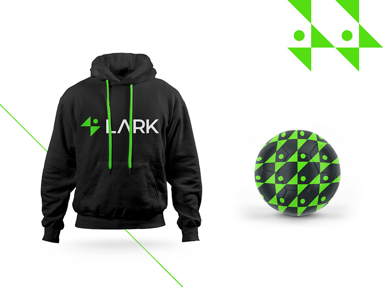
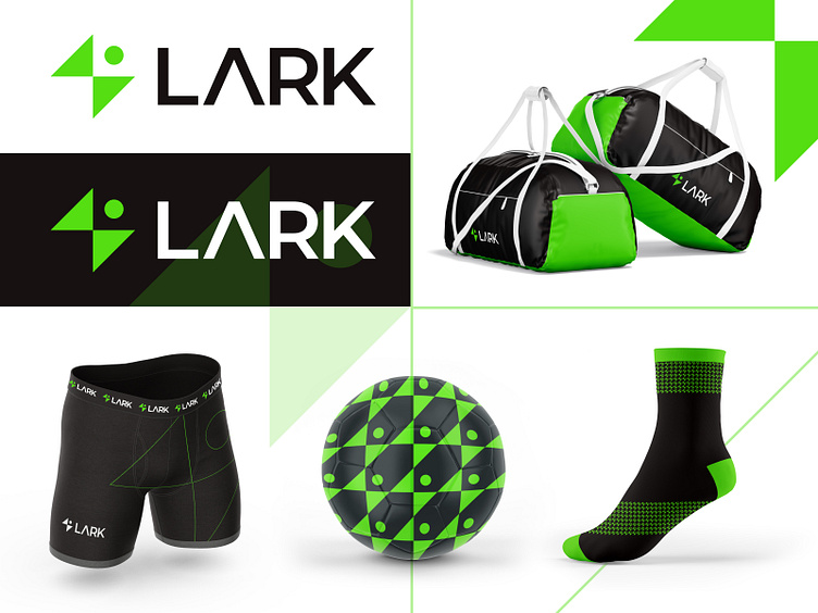
About the LARK logo: In the logo, we have tried to add energy and running icons. Because LARK is a sports management company and the most important thing for a sportsman is energy and running. In the logo, we added a running icon along with the energy icon. The entire logo represents a sportsman running with energy toward his brilliant career.
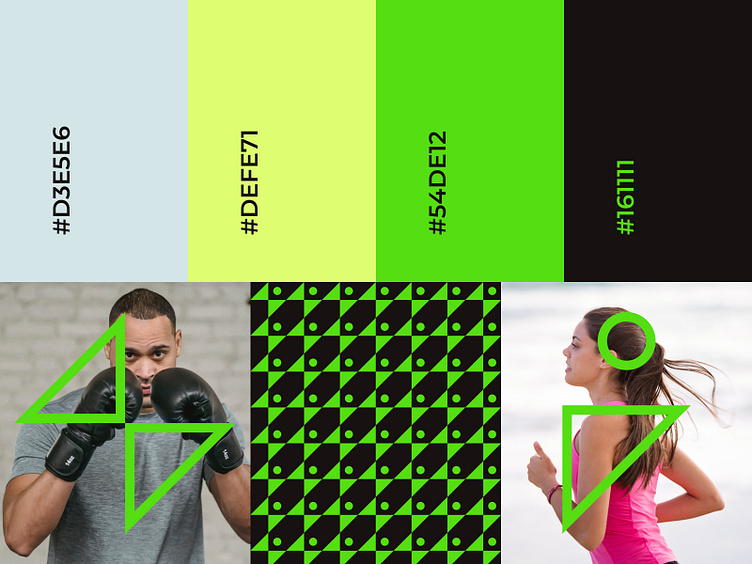
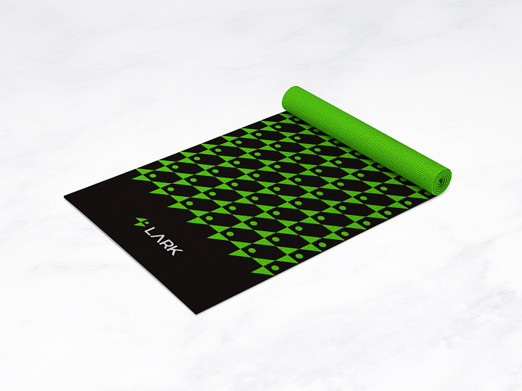
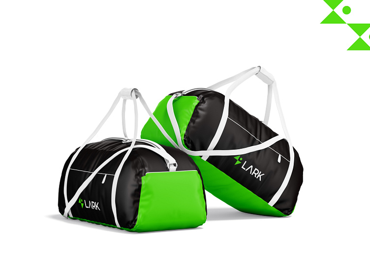
Color: Throughout the work, we have used more green and black work, because the color green represents the energy and freshness of a sportsman. And the black color signifies the professionalism of a sportsman. Energy and professionalism are very important for a sportsman's bright career.
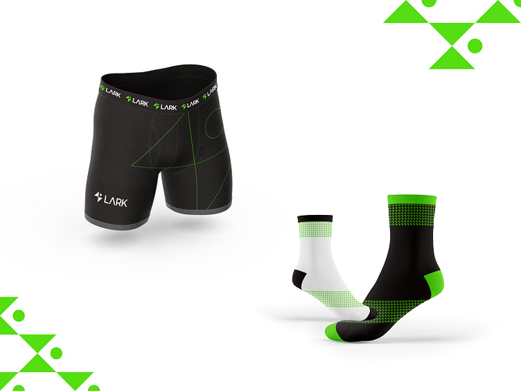
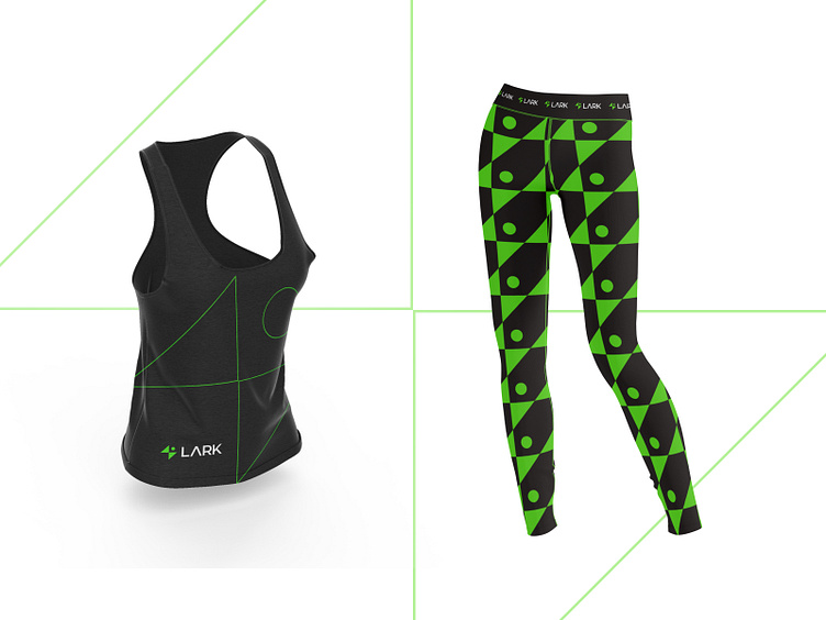
Branding: For branding, we always prefer logo icons. We create patterns from the shapes used in the logo and use them in branding. We have created some graphical elements, for use in branding and packaging. And added this to make the branding look eye catchy.
Who are we?
Kahaf is a dynamic and trendy design service agency. We usually help tiny & extensive companies to do Logo, Branding Design, UI/UX design, Mobile apps, and Product design. We receive the entire design process and think out solutions that work for businesses and users. Finally, we are cautious about work deadlines.
Let's start a project: hello.kahaf@gmail.com