Utility App Branding, Visual iIdentity, Corporate brand design
Project Overview
The objective of this project was to design a visual identity and branding for Patthar, a utility app focused on measuring stones. The app caters to professionals in the construction, landscaping, and mining industries, providing them with a simple, intuitive way to measure stones' dimensions, weight, and volume using their smartphones.
The goal was to create a modern, professional, and reliable brand identity that resonates with both technical users and those unfamiliar with digital measuring tools. The visual identity needed to communicate precision, reliability, and the industrial nature of the app, while also being accessible and user-friendly.
Brand Strategy
Brand Values: Precision | Reliability | Simplicity | Innovation | Professionalism
Target Audience: Construction Workers | Landscape Designers | Stone Suppliers | Quarry Managers | DIY Enthusiasts
Brand Tone: Clean | Trustworthy | Functional | Innovative
Iconography
Icons were designed to be simple and intuitive, guiding the user through the app with clear, understandable visuals. Each icon represents a key function of the app, such as:
Measurement tools
Stone categories
The icons are minimalist in style, ensuring that they remain clear even at small sizes on mobile screens.
Logo Design
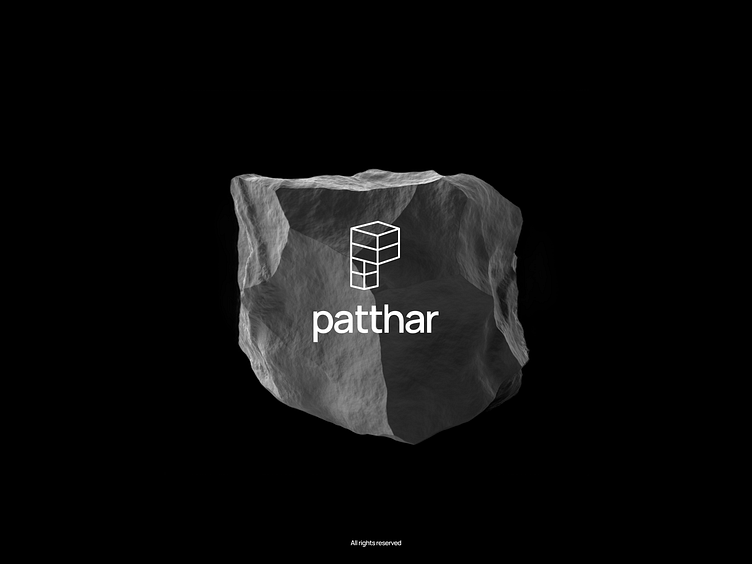
The logo design for Patthar combines industrial elements with a modern touch to convey precision and professionalism. The logo features:
Icon: A stylized measuring tape subtly integrated with a stone shape, emphasizing the app’s function of measuring stone dimensions.
Typography: Strong, geometric sans-serif typeface that conveys reliability and professionalism.
Color Palette: Shades of white and black, combined with a vibrant accent color for modernity and to stand out in the app store.
Logo Variations:
Full logo: Includes both the icon and the app name "Patthar"
Icon-only version: Used for app icons, favicons, and compact branding scenarios.
Marketing Materials
App Store Branding: The icon and logo are simplified for small-scale application, ensuring that they remain clear and recognizable at smaller sizes. The description text is concise and emphasizes the app’s utility and ease of use.
Landing Page: A clean and informative landing page with high-quality imagery of the app in use, emphasizing its ease of use and essential features. The page includes testimonials, app screenshots, and clear CTAs (Call to Actions) to download the app.
Social Media Graphics: Consistent branding across Instagram, Facebook, and LinkedIn, showcasing the app in different real-world environments (e.g., on-site at construction projects).
Takeaways
Simplicity is Key: Users value an interface that allows them to quickly and easily understand the app’s features. Stripping away unnecessary elements enhanced the user experience.
Brand Consistency: Maintaining a consistent color palette, typography, and logo across all platforms solidified the app’s identity and fostered trust with users.
User-Centered Design: Focusing on user needs led to the design of an app that feels both intuitive and powerful, allowing users to perform complex tasks effortlessly.


