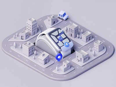
Moveitem — Logistics Website Hero Animation 📦
Hello Dribbble,
This is my previous Toptal work and this meticulously crafted visual encapsulates my imaginative interpretation of the landing page (with minimal effort of key-visual creation, thanks to UI8 for that) shunning the all too common pitfalls of erroneous branding cliches that so frequently mar the landscape of UX/UI design. (AVG 90%)
A little bit about this Business
We understand that moving large and expensive items can be stressful. After experiencing poor shipping solutions from other providers, we spent 25 years designing programs to make the process simple, safe, and affordable for everyone. Moveitem gives you access to one of the largest specially-equipped fleets in the United States, a network trained to handle your items with care. Click. Move. Relax.
***
So, I think that in general (design-wise) the client is always wrong.
💬 Agree or not? Share your thoughts and previous experiences.
🤝 Check the Instagram
✍️ Request Quote — https://ojus1lzci8o.typeform.com/to/ieMyfb6W
